
I did it!
This is the second time I’ve completed an October art challenge, although, despite my best efforts, I didn’t actually finish until January 3rd 2024 this year… Turns out designing and hand-painting 31 tiles and then digitally manipulating them into repeat patterns takes quite a lot of time, especially now I have a full-time job. So, while I will once again endeavour to keep on top of next year’s (this year’s!) challenge to a better degree than with this one, I’m genuinely just very happy that I completed the challenge and that I got to try something new along the way.
Massive thanks to Greekmythcomix for another fun set of prompts which really pushed me to think quite abstractly in some cases and which also introduced me to a figure I had never even heard of before, Talos! Thanks also to everyone who followed along with me on Instagram and Twitter.
Form
For a while, I have wanted to learn how to create repeat patterns using traditional media, so I thought I would use this year’s challenge as an opportunity to try it out. I also, very foolishly, thought that creating tiles which I could then “just copy and paste” to make a larger pattern would take less time than it would to just create a stand-alone piece like I did last year… The reality was that designing patterns so they properly overlap and then digitally editing them to they do actually line up properly (admittedly due mostly to my somewhat blasé attitude to measuring and cutting the sketching and watercolour papers accurately) and then editing them into posters, took about 4-9 hours of work per piece.
Despite the labour intensive process, I loved the process and getting to grips with a new skill; it was always genuinely delightful every time I got to see a single tile become part of a larger repeating pattern! This is a technique that I will definitely be carrying forward in other areas of my practice in the future.
Style
Like last year, my preference was to work quite closely from material sources but unlike last year, when I tended to replicate whole artefacts with added backgrounds, this year, I tended to pick certain visual elements from multiple artefacts and rearranged them in my pattern. Final patterns could have a mix of sources from vases to frescos to coins to statues.
Once again, backgrounds were generally painted in watercolour and patterns were generally painted in gouache, sometimes with added coloured pencil details. The way the gouache and coloured pencil were applied varied from piece to piece though. For example, the application of gouache in 3. Asterion is very flat and solid whereas in 24. Hephaestus, is much more layered and detailed.
Process
1. Researching source (30mins-1 hour)
For some pieces, I could spot a source I liked straight away; for others, it was much more of a chore…
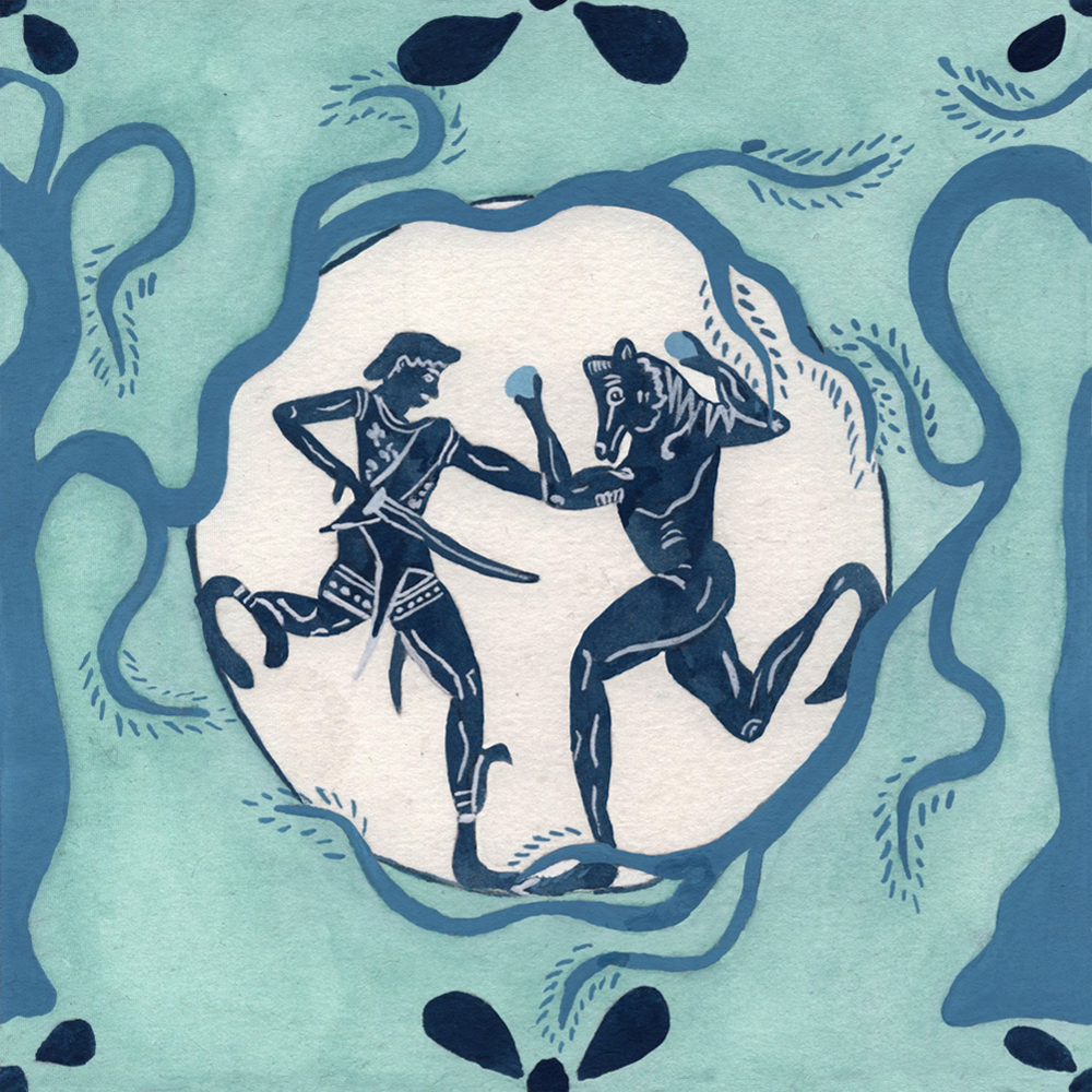
As I mentioned in my introduction, I searched for all kinds of material sources but then most common source type were vases and I very heavily relied on the Beazley Archive. My favourite sources, however, were, as always, frescos so if anyone knows of any kind of searchable database for them, please do let me know!
2. Sketching the tile design (30mins-1hr 30mins)
After finding the sources I wanted to work from, I would recreate my pattern by drawing from various elements of those sources. I had to also keep in mind how my pattern would carry across from the right side of one tile to the left side of another and the top of one tile to the bottom of another when they were repeated, and this had a big impact on composition too.
Creating these joining parts of my tile pattern involved a lot of folding and unfolding of my sketching paper…
3. Transferring the design to watercolour paper (30-45mins)
At the very start of this series, this step took a considerably longer amount of time to complete. This was because I was working with tracing paper. The process here involved me tracing the design onto one side of my tracing paper; flipping the tracing paper over and re-tracing the design to get the graphite onto a reverse image; and then flipping the tracing paper back over and re-tracing the original tracing onto the watercolour paper so that the graphite of the reversed image transferred onto the watercolour the right way round.
A couple of tiles in, I ordered some graphite transfer paper which meant I could then just layer the watercolour paper, the graphite paper, and then the sketch on top and then just trace the sketch one time to transfer it onto the watercolour the right way around. This significantly sped up the process but there were some instances when this still took a really long time because I had made quite a complicated design…
4. Painting in the background (30-45mins)
Since I knew I would be painting in the main pattern elements in gouache, which is very water-soluble and can smudge if re-wet, I knew I had to paint the background in first so I could get crisp lines between the background and the patterns.
Sometimes I already had a strong feeling about the background colour I wanted because it would reflect something about the figure in question. For example, blue for 26. Thetis and the sea, since she is a sea nymph. Knowing this early would sometimes mean I had a greater overall vision for the entire colour palette too. In some cases though, I didn’t really have any strong feelings about colour and in these cases, I benefitted greatly from flicking through my Dictionary of Colour Combinations for some extra inspiration.
5. Painting in the patterns (1hr-2hrs)
The length of this stage depended on how complicated the pattern was and also, as above, how sure I was about colour combinations. Sometimes I knew instantly, sometimes I had to sound it out and even repainted sections of patterns if I was unhappy with how it was going. It also depended on the style I was employing. Flat, solid fills of colour were obviously faster than adding layers of smaller details and/or adding coloured pencil shading too. The extra time was worth it in my opinion though as my favourite styles to paint and look at were the Roman frescos.
6. Digital editing (1hr-2hrs 30mins)
This stage was the real time pit! While I did try to measure and cut my perfect squares for my sketching paper and my watercolour paper, I was also quite impatient, and my perfect squares were not so perfect after all. At this stage, then, I had to scan in my work and then line it up as best I could in a square artboard in Illustrator.
I then had to digitally clean up any blemishes using the clone stamp tool.
Next, I would paste two of my square tiles next to each other, left to right. Often, the patterns would mostly line up, but not quite. Once I joined the layers together, I used a combination of the clone stamp tool and puppet warp to line the joining patterns together properly. Once I did this, I then pasted another set of two tiles below the first too and repeated the process, but aligning the patterns from the bottom to the top of the tiles this time.
Now I had a 4-tile pattern, but it was not quite ready to be reproduced. I had to then copy the sections from the adjoining patterns from the middle of the tiles to the edges of the tiles so that they would line up when I copied the now complete 4-tile pattern to make a 16-tile pattern. I also retook a copy of one single square tile from the 4-tile combination and saved it as this version now had all the correct copied edges so if you wanted to make a repeat pattern using that one tile, they would actually line up properly.
Once I had my 16-tile pattern, I then inserted it into the poster template I had created and edited it so it had the name of the figure I had created the pattern for and changed the border colour to fit in with the rest of the poster.
A Note on Sources
I have tried to research each artefact as best I can and have provided the provenance of each item, along with a link so you can see the original. However, from many an undergrad experience, I’m sure some of my dates or descriptions aren’t precise enough so please do let me know if you spot an error so I can amend it!
Illustrations for Sale
Last year, I put up my illustrations on Redbubble but from my experience, the cut they take is a bit too big for me to justify… I have left last year’s illustrations up and can still purchase prints and other merch from that Redbubble store if you so wish however, my plans for this year’s illustrations are slightly different. This year, I will produce a small booklet (probably A5) which will include all my Classicstober2024 illustrations. Additionally, I will print a selection of the posters in either A4 or A3 size (I need to look further into costs). These products will then be available on my shop which is hosted on this website when I reopen it. However, since this will mean an upfront cost for me, I can only print so many designs at first so it would be really helpful for me if you dropped a comment here or reached out to me via email to let me know which designs you would prefer to be available! If things go well, I may look into releasing another round of designs.
Final Note
For each prompt, I have provided an image of the single tile design and two versions of the poster, one with a smaller pattern and one with a larger pattern.
Thank you very much for taking the time to read through my very long introduction, I hope you enjoy looking at my illustrations now! Please do leave a comment or send an email if you want to chat about anything to do with this series!
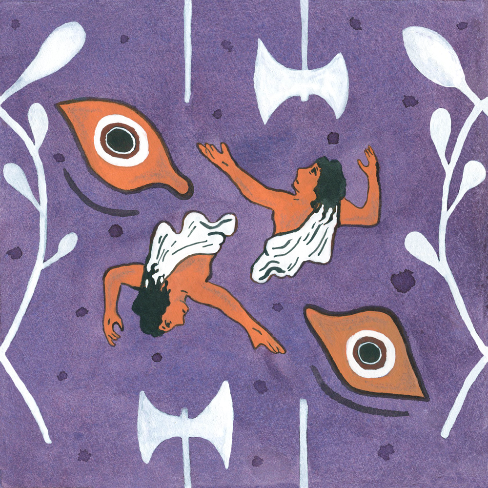
CASSANDRA
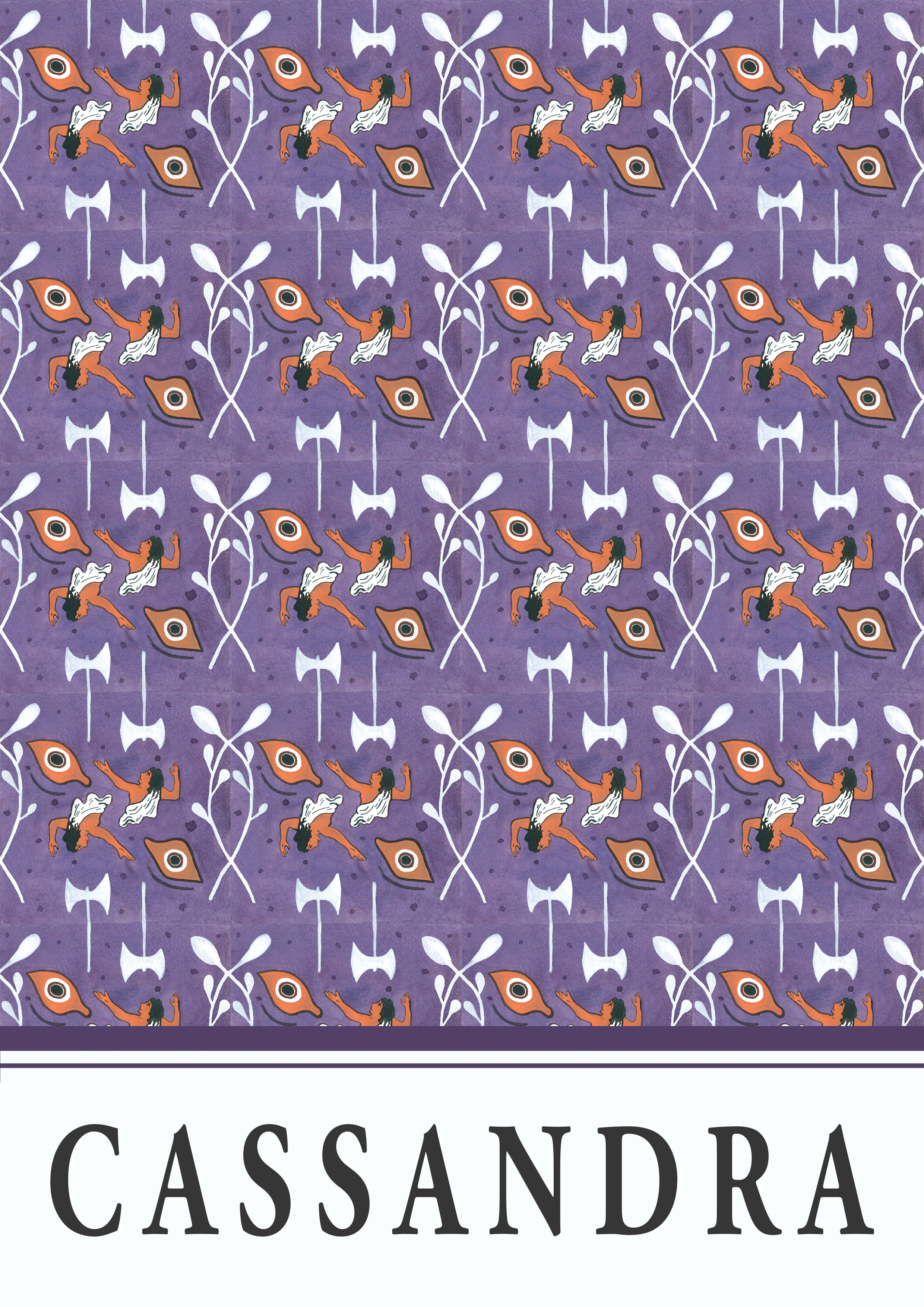
This is the first design I created for this series, so it did take quite a bit longer while I got used to the repeated pattern process. While I did extrapolate from the original Cassandra vase design and re-created my own pattern, I did generally stick to the original red-figure colours for the main elements. Since I had already chosen purple as the background colour, I ended up with a purple and orange combination. While I think this works for contrast reasons, it’s not a colour combination that I am particularly keen on, personally. As the series progressed, I generally deviated from the colours used in the original artefacts and focused more on my own colour combinations but there are exceptions, like the terracotta colouring of the Medusa antefix (2. Medusa) and the Cupid and Psyche statuette (21. Psyche) or the polychromy of the Peplos Kore (27. Pygmalion). In these cases, however, I think I spent more time considering how the background colours and the colours of other decorative elements would play into the overall colour scheme.
There was also a little colour re-mixing in this design too, though. Cassandra’s dress and the axe and bough motifs are also in red slip on the original vase but I decided to paint them in white here for contrast reasons (particularly for the dress as this helped to tie in the Cassandra figures better with the eye motifs and bring greater focus to her as part of the central design).
I added some decorative dots in the background which were not part of the original design. While I think this does make the tile design more interesting, I hadn’t really considered how their placement would look as part of a larger pattern. While the final result was not disastrous, this is why I decided against adding in unplanned background elements for the rest of the series (with the exception of 4. Lycaon).
Overall, while a little digital jigsawing was needed (as was the case for all my tiles), I enjoyed working on my first-ever repeat pattern and really was delighted to see it all come together in Photoshop. This is a technique that I will definitely be using outside of this series.


Cassandra figure, axe motif, and bough motif
c. 450-400BC
Greek, Athenian
Museo Nazionale di Spina. Ferrara, Italy.
Eye motif
Terracotta kylix depicting Theseus and the Minotaur in between two eyes on the inverse and obverse
c. 530BC
Greek, Attic
The Metropolitan Museum. New York, United States.
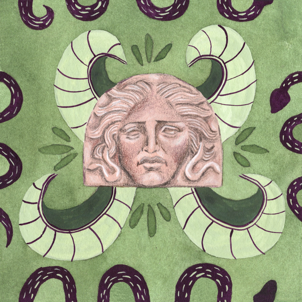
2. MEDUSA
I chose to use this antefix as the main decorative element because of how sad Medusa looks here. At least when I was a kid, Medusa was presented more as a monster, although I do think that is changing now. I liked how sad she looked here, then, because it puts a greater focus on how tragic and unfair her narrative really was.
I am, however, also a big fan of Archaic representations of Medusa (here’s a cover I did for Classics for All based on an Archaic terracotta antefix of Medusa from c.540BC). So, as a kind of compensation for choosing a 4th century artefact as the main decorative element, I added in some Archaic gorgon wings as part of the central design.


Medusa antefix
Terracotta head of Medusa antefix
c. 4th century BC
Greek, South Italian
The Metropolitan Museum. New York, United States.
Snake motif
Painted ceramic alabastron with two cocks and snake Greek
c. 620-590BC
Early Corinthian
Museum of Fine Arts. Boston, United States.
Gorgan wings motif
Black-figure amphora depicting a Gorgan in movement
c. 530BC
Greek, Athenian
The J. Paul Getty Museum. Malibu, United States.
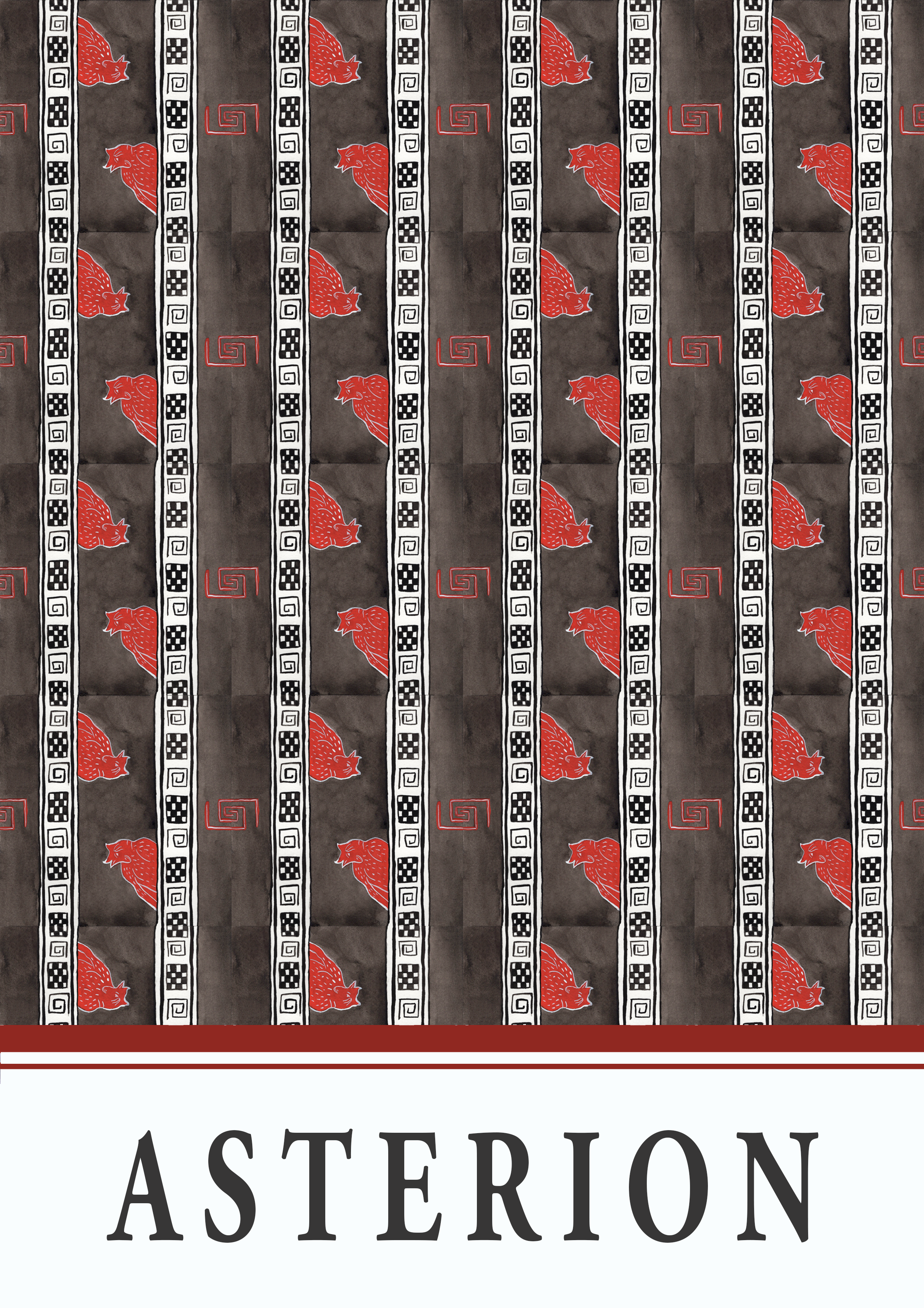
3. ASTERION
This design is based on one of my favourite Greek vases whereby the painter has used the commonly-seen spiral design to represent the much larger and vast labyrinth in which Asterion was kept.
I remember being quite busy on the day I was doing this one and thought I was being very clever by doing it primarily in black and white (with some red) because I thought it would save a lot of time. In the end, and this should have been unsurprising really, lining up the tiles and digitally manipulating them so they did actually fit together was quite fiddly with some of those smaller design elements. I think this one actually stretched over two days…


Minotaur figure and labyrinth motif
Red-figure kylix depicting Theseus killing the minotaur, attributed to the Codrus Painter
c. 440-430BC
Greek, Attic
British Museum. London, England.
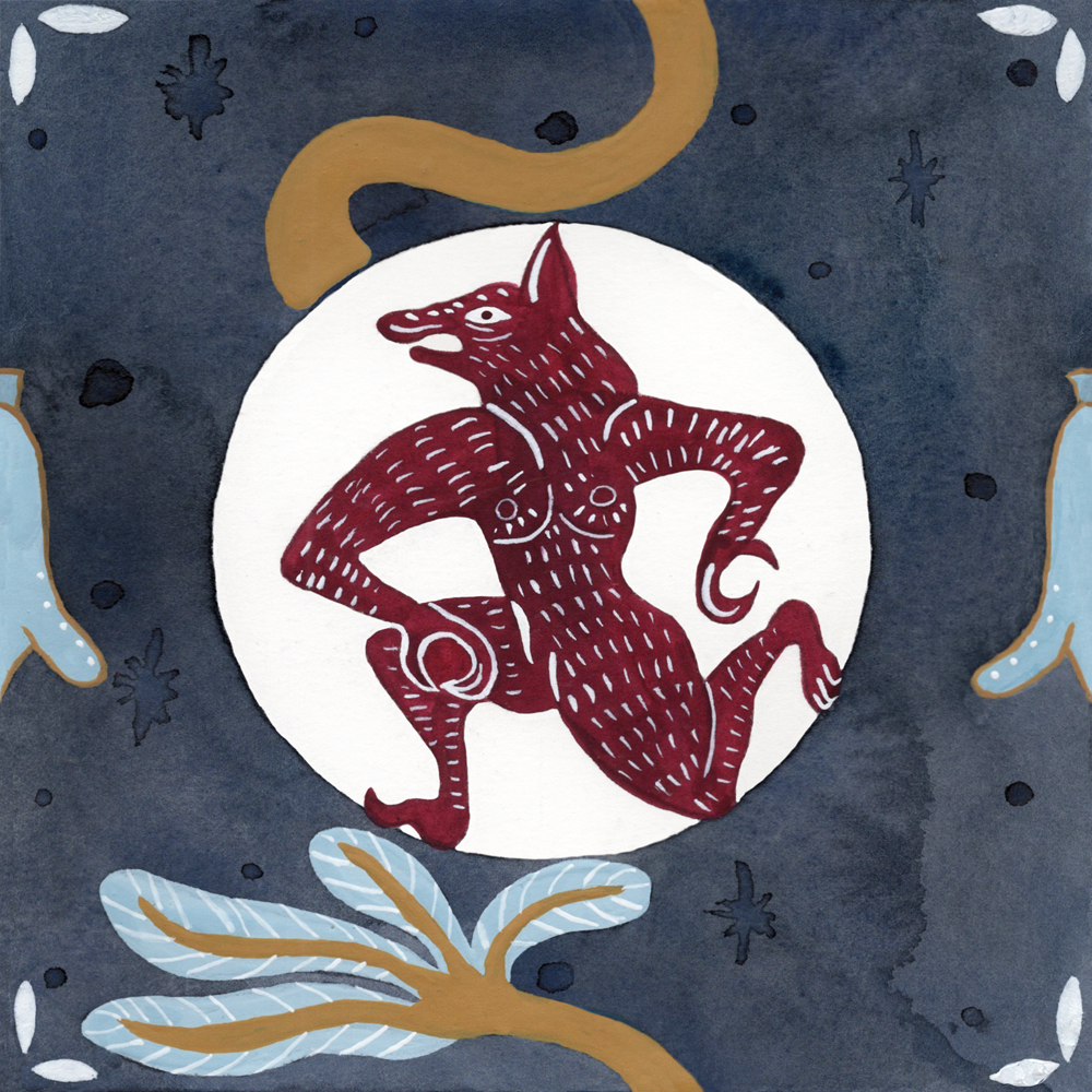
4. LYCAON
This is my first favourite of the series and marks the start of a “good” 5 tile/poster streak! I really like the colour combination used here (I really must use pale blue and a dark golden yellow more often) and the stylisation of the werewolf figure really reminds me of the Chinese papercut bookmarks I used to get gifted as a child.
I also enjoy having used decorative elements in the corners of the tiles to create a larger pattern once the tiles were repeated. Additionally, I liked using the negative painting technique with the watercolour background to carve out a plain, white paper moon behind the werewolf.


Wolf-man figure, tree motif, and flower motif
Etruscan black-figure Pontic plate depicting Herakles attacking Nessos pursuing Deianeira with a wolf-man in the centre, attributed to the Tytios Painter
c. 520BC
Vulci, Osteria
Museo Nazionale Etrusco, Villa Giulia. Rome, Italy.
5. CHIRON
Inspired from the colour of Minoan frescos, this is another tile/poster set for which I really enjoy the overall colour combination. My favourite part of this design, however, is the floral design which I extrapolated from original vase as I think it has a very art deco look to it.
My tracing of the sketch and measuring and cutting of the watercolour paper for this one must have been quite bad though, because I remember having a lot of trouble lining and joining up the shell motif…


Chiron figure and natural elements
Red-figure amphora depicting Chiron holding Achilles as a boy in his hand, attributed to Oltos
c. 520BC
Greek, Attic
Musée du Louvre. Paris, France.
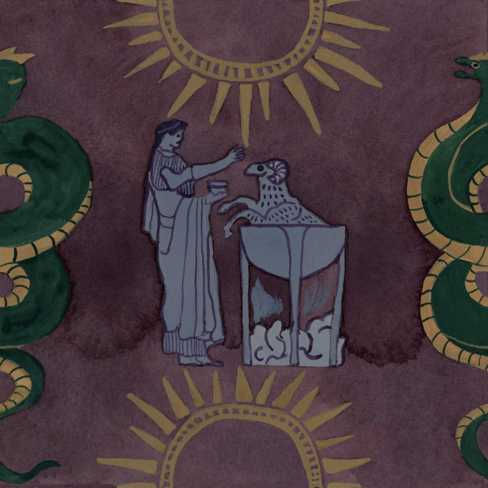
6. MEDEA
This one is another of my overall favourites! This is mostly because of the colour combinations that centre on that wine-purple background colour which gives a dark, rich, and powerful tone very suitable to Medea herself. I also like that the figural Medea imagery focuses on her magical abilities and her actions before the slaughtering of her sons. However, at the same time, the sun and serpent/dragon motifs refer to the iconic red-figure calyx krater which depicts Medea flying off on her chariot after she has killed her children, so this part of her narrative has not been brushed under the carpet.


Sun and snake/dragon motif
c. 400BC
Greek, Lucanian.
The Cleveland Museum of Art. Ohio, United States.
Medea boiling a goat in a cauldron figure
c. 480-470BC
Greek, Attic.
The British Museum. London, England.
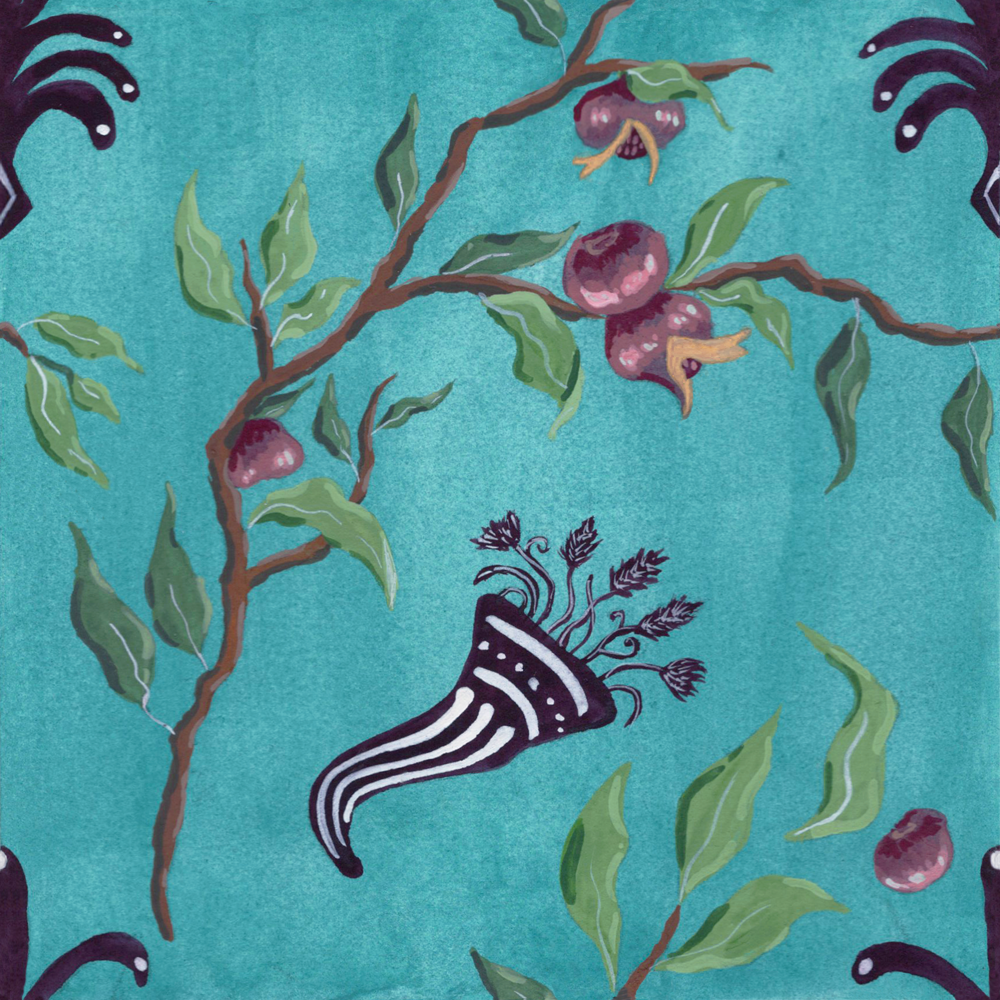
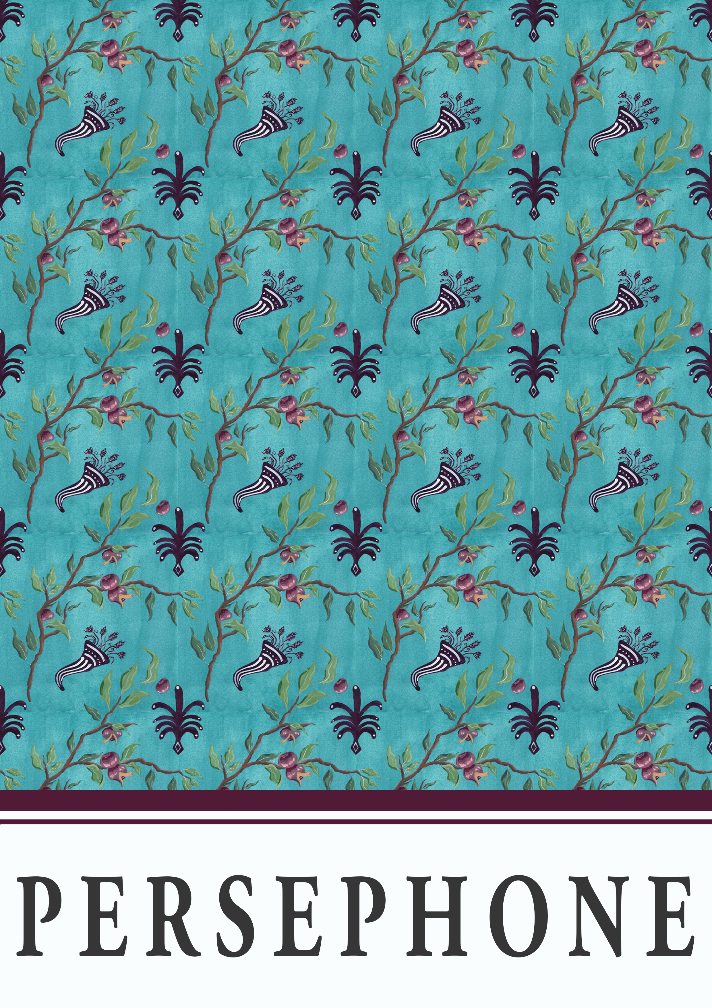
7. PERSEPHONE
Again, another favourite (don’t worry, the streak will very much end shortly…). While I do very much like the colour combinations here too, my favourite aspect of this one is the style of the boughs as I am a big fan of Roman frescos (particularly the nature-based ones) in general. I think the style of nature-based frescos, in Pompeii and Herculaneum in particular, suit my preferred choice of medium, gouache, and some of my favourite subjects to paint, birds and plants, very well.
This is also the first design in this series which does not feature a figural representation of the character in the prompt and instead only relies on one of their attributes, namely, pomegranates.
Personally, I think this pattern would make a very nice wallpaper…


Pomegranate and bough motif
Garden mural from the “triclinium” of Livia
c. 30-20BC
Roman, Roman
Museo Nazionale Romano, Palazzo Massimo alle Terme. Rome, Italy.
Decorative element
c. 330BC
Greek, Apulian
The J. Paul Getty Museum. Los Angeles, United States.
Cornucopia motif
Red-figure loutrophoros depicting Plutus and Demeter, attributed to the Painter of Louvre
c. 350-340BC
Greek, Apulian
The J. Paul Getty Museum. Malibu, United States.
8. ICARUS
This entry is interesting because it is a reminder that his project is one of two halves: the individual tile design and the overall pattern/poster design. When I was designing this tile and sounding out the colours as I painted it, I was very unsure about it and very nearly started from scratch. Since I was cautious of time though, given I’d already started the project a week late and was definitely not producing a design a day as I was meant to be, I decided to just carry on with the original tile design and see what the overall pattern looked like. I’m really glad I did this because I think this is one of the most effect overall patterns in the series. I particularly like how the organic wash pattern of the watercolour background, which has pooled more heavily to the left of the tile design, repeats in the overall pattern.

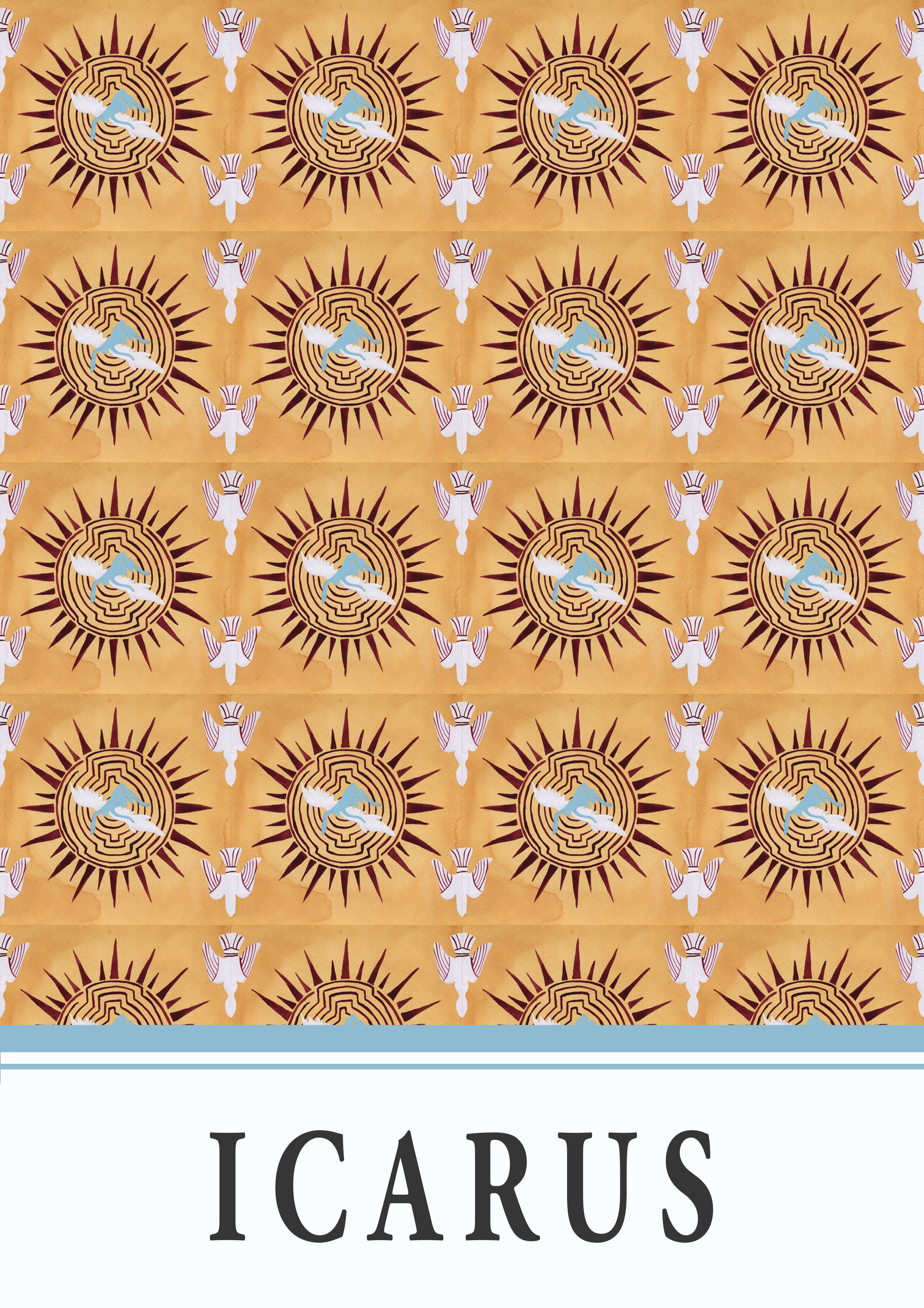

Falling Icarus figure
Fresco depicting the fall of Icarus
c. 40-79AD
Roman, Pompeian
In situ, The House of the Priest Amandus. Pompeii, Italy.
Sun motif
c. 400BC
Greek, Lucanian.
The Cleveland Museum of Art. Ohio, United States.
Diving bird motif
Red-figure terracotta lekythos depicting Icarus or Hypnos, attributed to the Icarus Painter
c. 2nd quarter of the 5th century BC
Greek, Attic
The Metropolitan Museum. New York, United States.
Labyrinth motif
Silver coin depicting the labyrinth
c. 5th century BC
Greek, Cretian
Museo Nazionale Romano. Rome, Italy.
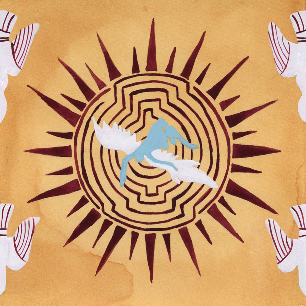
9. ACHILLES
And thus, the positive streak ends… This is one of my least favourite designs in the series and marks the start of a “bad” 5 tile/poster streak. The problems started with the fact that I didn’t really engage with any of the usual Achilles imagery whereby he was fighting someone or playing dice. As a result, I ended up focusing on an image of a nereid (presumably Thetis) carrying his arms while riding a dolphin, which is perhaps not the most obvious path to have taken. What I should have done, and perhaps I will re-do in the future, is to have followed my original plan of basing my pattern and colour combination on the fresco depicting the ambush of Troilus (which is where I got my tree motifs from).
I also think this pattern ended up being quite wonky and I don’t like the colour combinations very much. It all feels a bit Christmas-y to me and not very Achilles at all…


Shield motif
c. 525-475BC
Greek, Etrurian
State Hermitage Museum. St Petersburg, Russia.
Tree motifs
Fresco of the ambush of Troilus
c. 540-530BC
Etruscan
In situ, Tomb of the Bulls in the Necropolis of Monterozzi. Tarquinia, Italy.
Nereid and dolphin figure
c. 475-425BC
Greek, Athenian
State Hermitage Museum. St Petersburg, Russia.
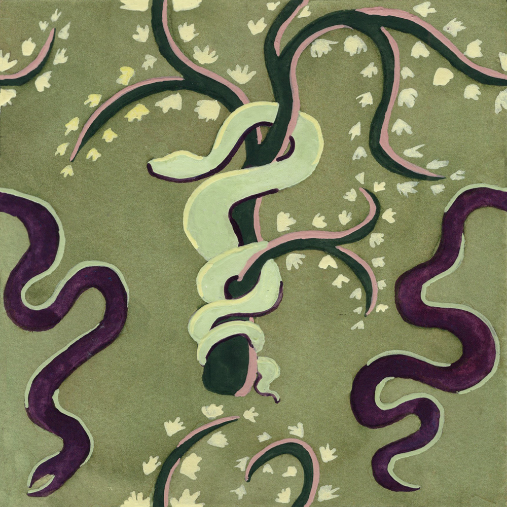
10. ASKLEPIUS
Again, not really a fan of this one. I think the pattern is a bit boring and, although snakes are obviously an important part of Asklepius’ imagery, I don’t think it particularly screams, ‘Asklepius’, especially since snakes are an important attribute of many classical figures. I did briefly consider including some of those votive body part sculptures found at sanctuaries that people would leave as offering to heal ailments corresponding to their own bodies, but I wasn’t entirely sure how this would come across.
Colour-wise, this is okay. I do really like the sage green and the baby pink together though and I do think the overall colour combination with the pale-yellow leaves give off a kind of ‘fairies in the woodland’ vibe.


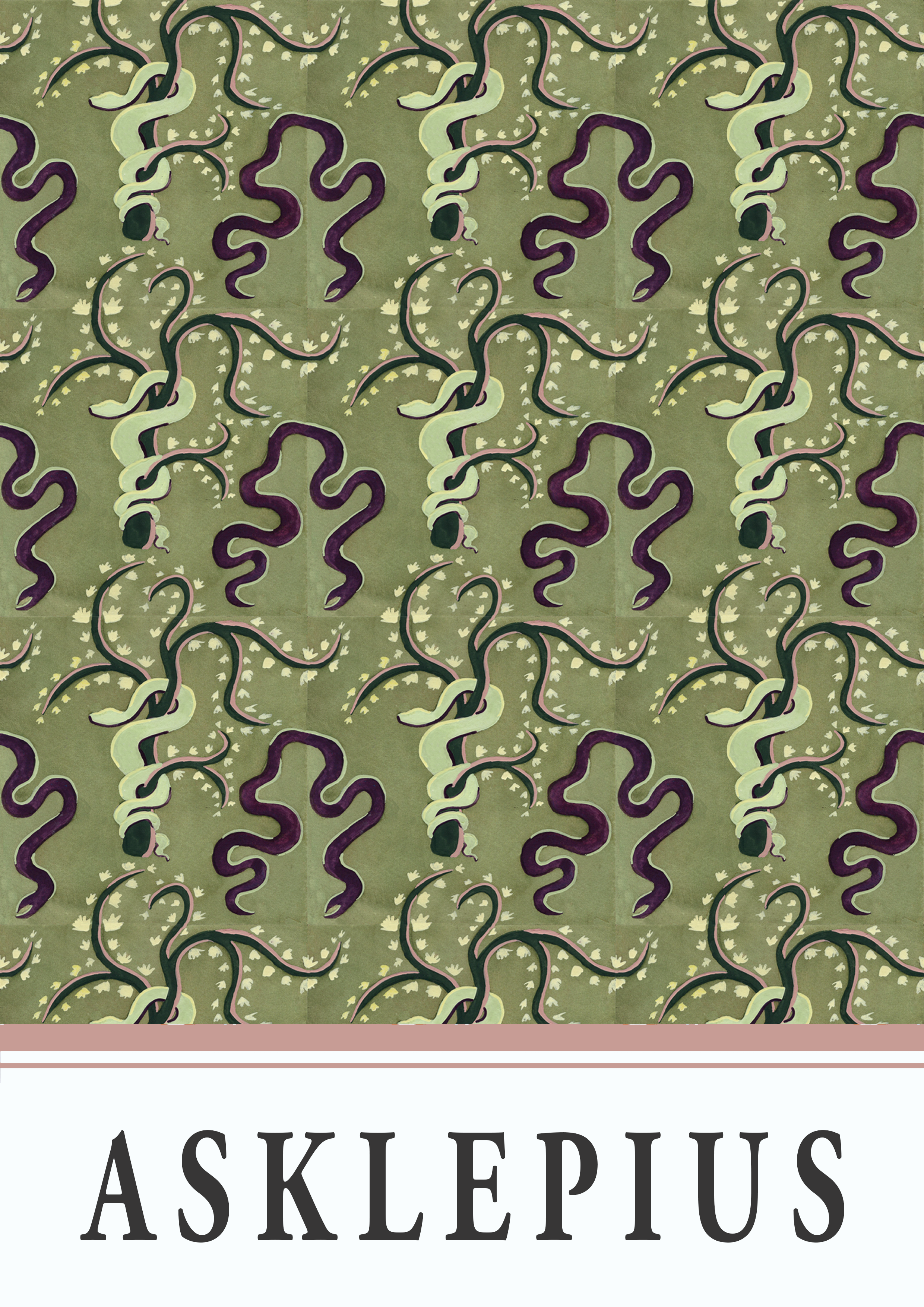
Snake on bough motif
Red-figure volute krater depicting the Garden of Hesperdes, attributed to the Lycourgos Painter
c. 360BC
Greek, Puglian
Jatta National Archaeological Museum. Ruvo di Puglia, Italy.
Plain snake motif
c. 133-27BC
Greek, Pergamene
???
11. PANDORA
I really dislike this one. I don’t like the colour choices at all. I think the light pink that outlines Pandora is far to fair and blends in too much with the background and while I was keen to use natural colours for the branches here, I think it conflicts with the background colour choice.
Regarding the design itself, I’ve taken the tiny bough motif from the original vase and depicted larger branches radiating from Pandora to try to represent the evil that was released from the box she opened. I’m not entirely convinced this translates though and I’m not entirely sure how fair this is to Pandora either (those darn gods!).


Pandora figure, bough motif, and decorative elements
c. 450BC
Greek, Attic
Museum of Fine Arts. Boston, United States.
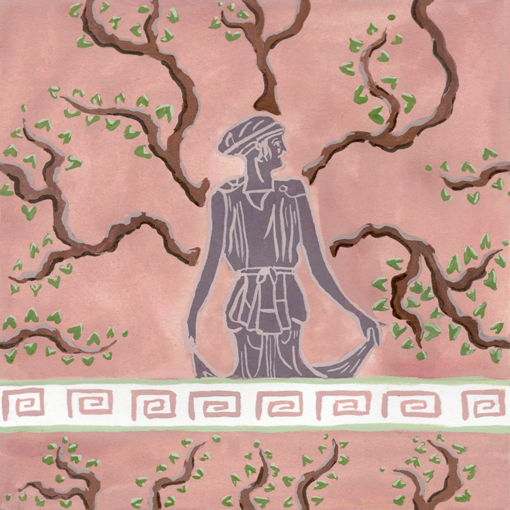
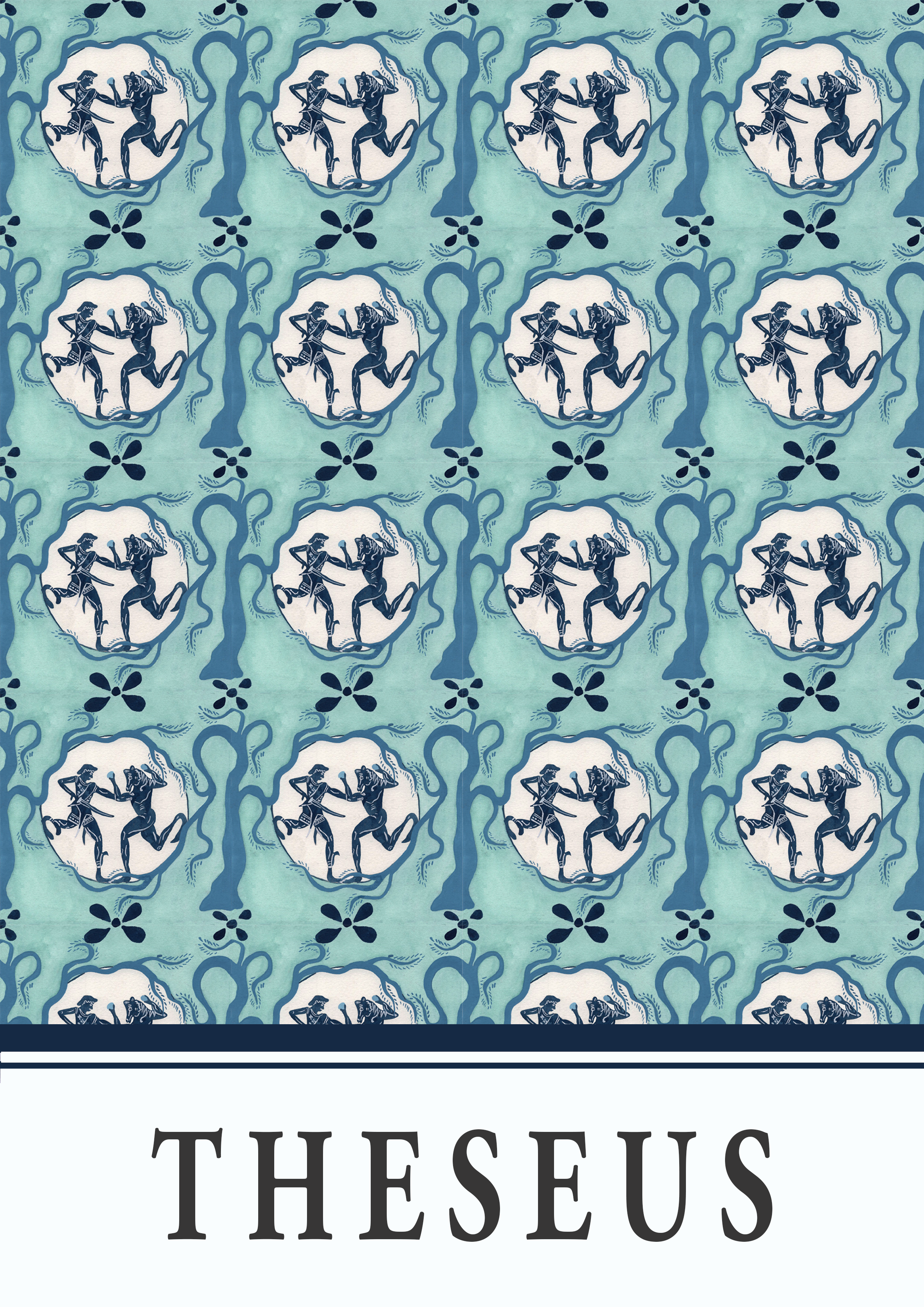
12. THESEUS
I think this one has grown on me a little. At first, I really didn’t like the overall colour combination, but I think that if the contrast between the blue of the tree motif and the blue of the figures was a little stronger and if there was some additional white element in the poster, the balance would be better.
As it stands, I actually quite like the overall design itself and while I would like the colour tweaks I outlined above, the colours as they are okay and remind me a bit of fine china.


Theseus and the Minotaur figures
c. 550-500BC
Greek, Athenian
Museum of Fine Arts. Boston, United States.
Vegetal motif
Red-figure hydria depicting a vegetal motif, attributed to the group of Polygnotos
c. 475-425BC
Greek, Athenian
Antikenmuseum Basel und Sammlung Ludwig. Basel, Switzerland.
Tree motif
Red-figure cup-C depicting Theseus and Sinis, attributed to Apollodoros OR the Elpinikos Painter
c. 525-475BC
Greek, Athenian
Antikensammlungen. Munich, Germany.
13. ARACHNE
I think the potential for this one was there, but the execution was somewhat lacking.
I have no real reasoning for this, but I wanted to use a Fayyam mummy portrait as a stand-in for Arachne. I think I was excited to re-create another Fayyam mummy portrait (here is one I have done in the past) because I think this style of painting also fits very well with my favourite medium, gouache (with some added details in coloured pencil). However, once again being quite conscious of time, I felt I rushed this one and I’m not very keen on the way it turned out.
I was also excited by the idea of taking the decorative motifs from the vase image depicting Penelope at her loom and placing them behind the “Arachne” portrait and using the spiralling elements as “legs” to create a kind of spidery image. I made some of the “legs” a bit too long though and when the image was repeated, I think that overall “spider” pattern was repeated too close to itself and it’s not entirely clear that was what I was going for.


Portrait
An Al Fayyum mummy portrait depicting a wealthy young woman
c. 2nd century AD
Egyptian, Faiyum
The Egyptian Museum. Cairo, Egypt.
Unfortunately, I could not locate this artifact within a catalogue so these details are quite vague… Please let me know if you have any further details! This image does feature in a National Geographic article, but it is behind a paywall/
Loom motif and decorative elements
c. 450-400BC
Greek, Etrurian
Museo Archeologico Nazionale. Chiusi, Italy.
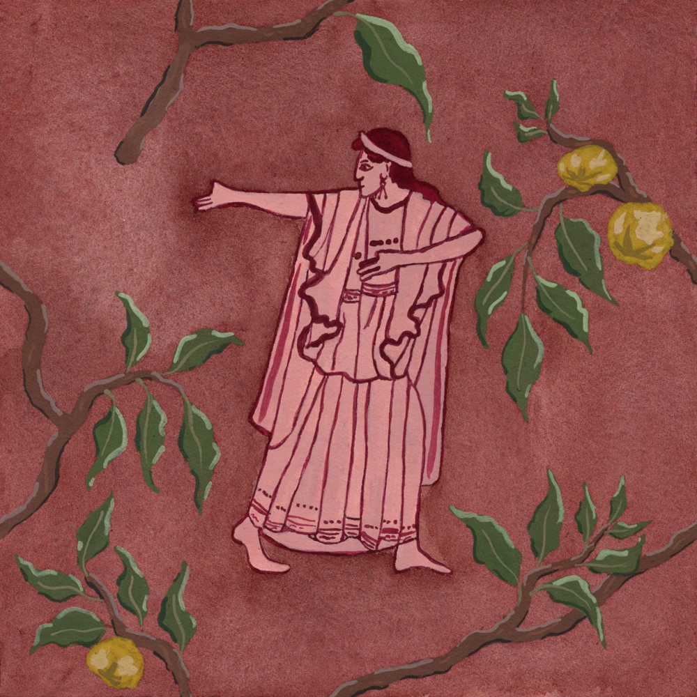
14. HELEN
Another one of my favourites! I’m very pleased with the colour combination here and particularly like the peachy pink Helen figure against the slightly de-saturated blood-red background. I’m also a fan of the dark golden yellow of the apples against the red background.
Once again, I really like the organic nature of the watercolour background wash and how it has not dried entirely solidly. The repeated pattern created by the uneven pooling of the watercolour is much more interesting that flat colour, I think.
Again, I’m just such a big fan of the Roman fresco-style boughs!


Helen figure
Red-figure hydria depicting Menelaus pursuing Helen, attributed to the Syrikos Painter
c. 480BC
Greek, Attic
The British Museum. London, England.
Apple bough motif
c. 2nd half of the 1st century BC
Roman, Roman
Museo Nazionale Romano di Palazzo Massimo. Rome, Italy.
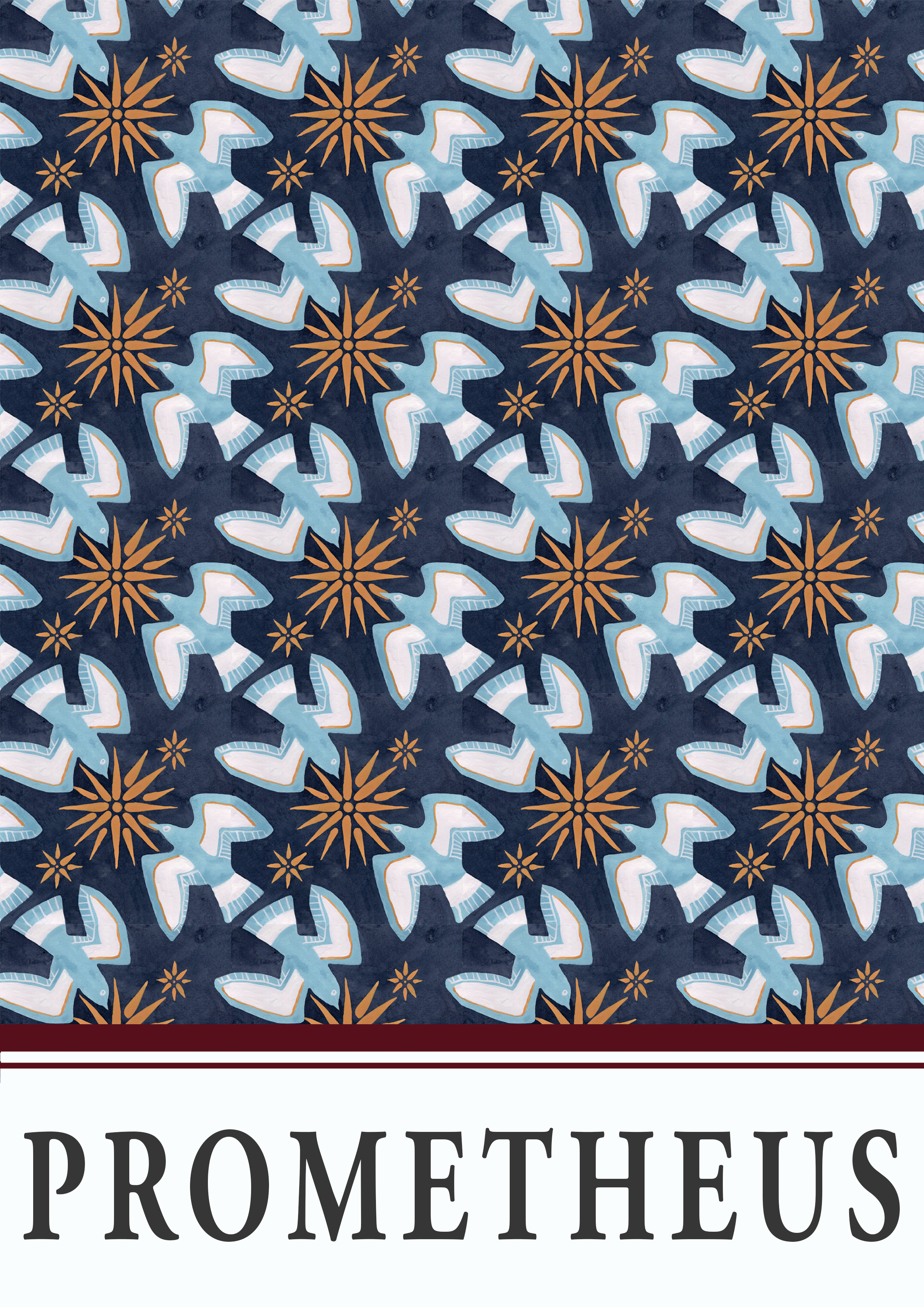
15. PROMETHEUS
Yet another favourite (I’m on a roll!). This tile design uses much larger pattern elements than most of the other tiles in this series and I think I should have done this more often as I like how much bolder and more striking the final repeating pattern is.
This is one of the tiles that doesn’t explicitly reference the prompt figure in question and, instead, relies on related attributes. The eagles are fairly obvious, but I’ve also used the Vergina sun motif as a stand in for the fire which Prometheus stole from the gods. It has been pointed out to me, and you know who you are, that the sun is not exactly the same as fire (I hope it is obvious that I do, in fact, know this) but to that I say, “artistic licence” and, perhaps less convincingly, “It looks cooler”.
I also really like the colour combinations here and I think, in a much more positive way than I think about the Achilles design, it does look quite (accidentally) Christmas-y.


Eagle motifs
c. 560-550BC
Greek, Laconian
Musée du Louvre. Paris, France.
Sun (“fire”) motif
Red-figure amphora depicting a Vergina sun
c. 540-530BC
Greek
Musée du Louvre. Paris, France.
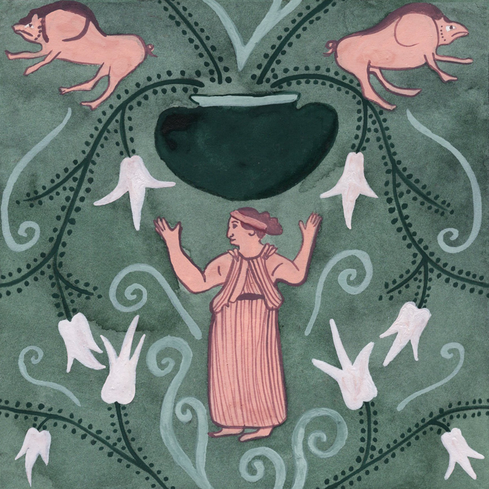
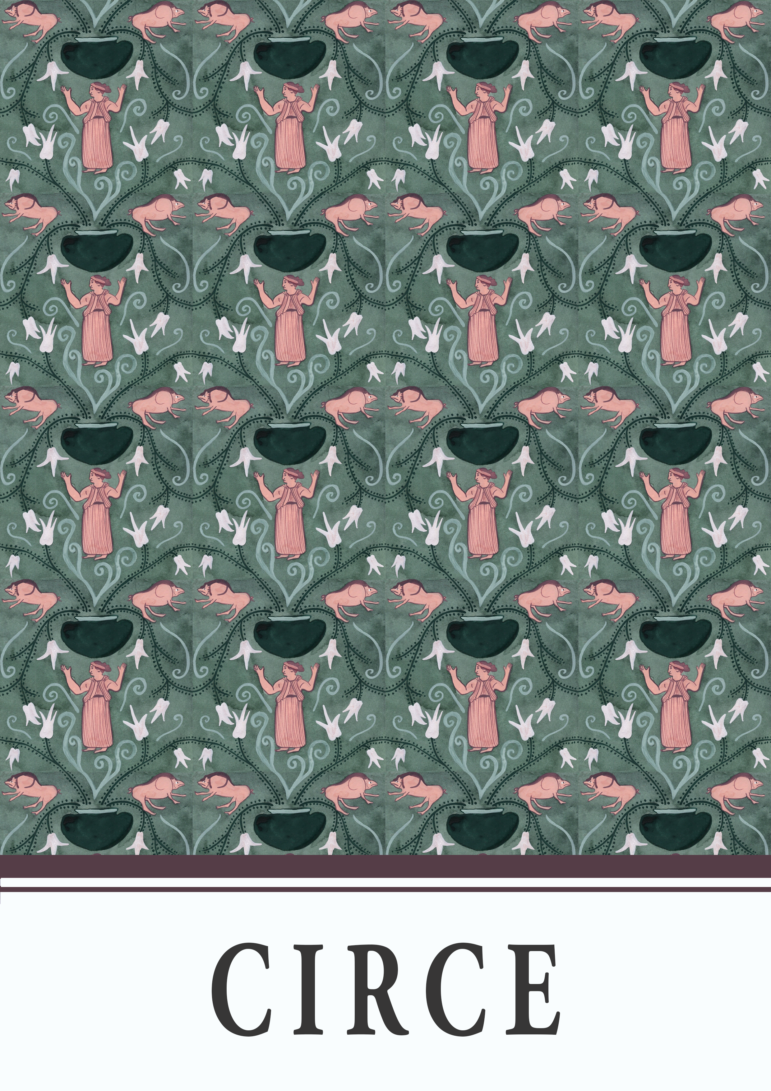
16. CIRCE
Accidentally went full-Morris on the colours with this one and I love it!
One thing that I have noticed about my tile designs is that my default is to be quite symmetrical with my designs, which means that the overall repeat pattern is not always that seamless and it’s quite obvious that it’s made up of repeating squares (which is not necessarily a bad thing). Throughout this project series, there have been some attempts to break out of this symmetry and some efforts were definitely stronger than others. This tile is pretty stringent on symmetry apart from a last ditch effort to break some of that up with the asymmetrical smoke coming off the cauldron…


Circe figure
Red-figure stamnos depicting Odysseus and Circe, attributed to the Settecamini Painter
c. 350BC
Greek, Etruscan
National Archaeological Museum of Parma. Parma, Italy.
Cauldron motif
Black-figure neck amphora depicting Medea boiling a ram, attributed to the Leagros Group
c. 520BC
Greek, ???
Harvard Art Museums. Cambridge, United States.
Pig motifs
c. 500-450BC
Greek, Athenian
The Fitzwilliam Museum. Cambridge, England.
17. ATALANTA
This is another one which has somewhat grown on me. When I first finished this one, I really did not like the overall colour combination and thought it looked a bit dull. However, now I think it looks less dull and more muted and, actually, that muted background helps the lions to pop out more.
Speaking of the lions though, they are not the most well-painted things in the world… What I do like figuratively, though, is Atalanta herself. In particular, I like how she is depicted only in line-work, with no solid background colour behind her as I think it helps to emphasise the beautiful original line work on the vase and helps to amplify the translucent quality of her dress.

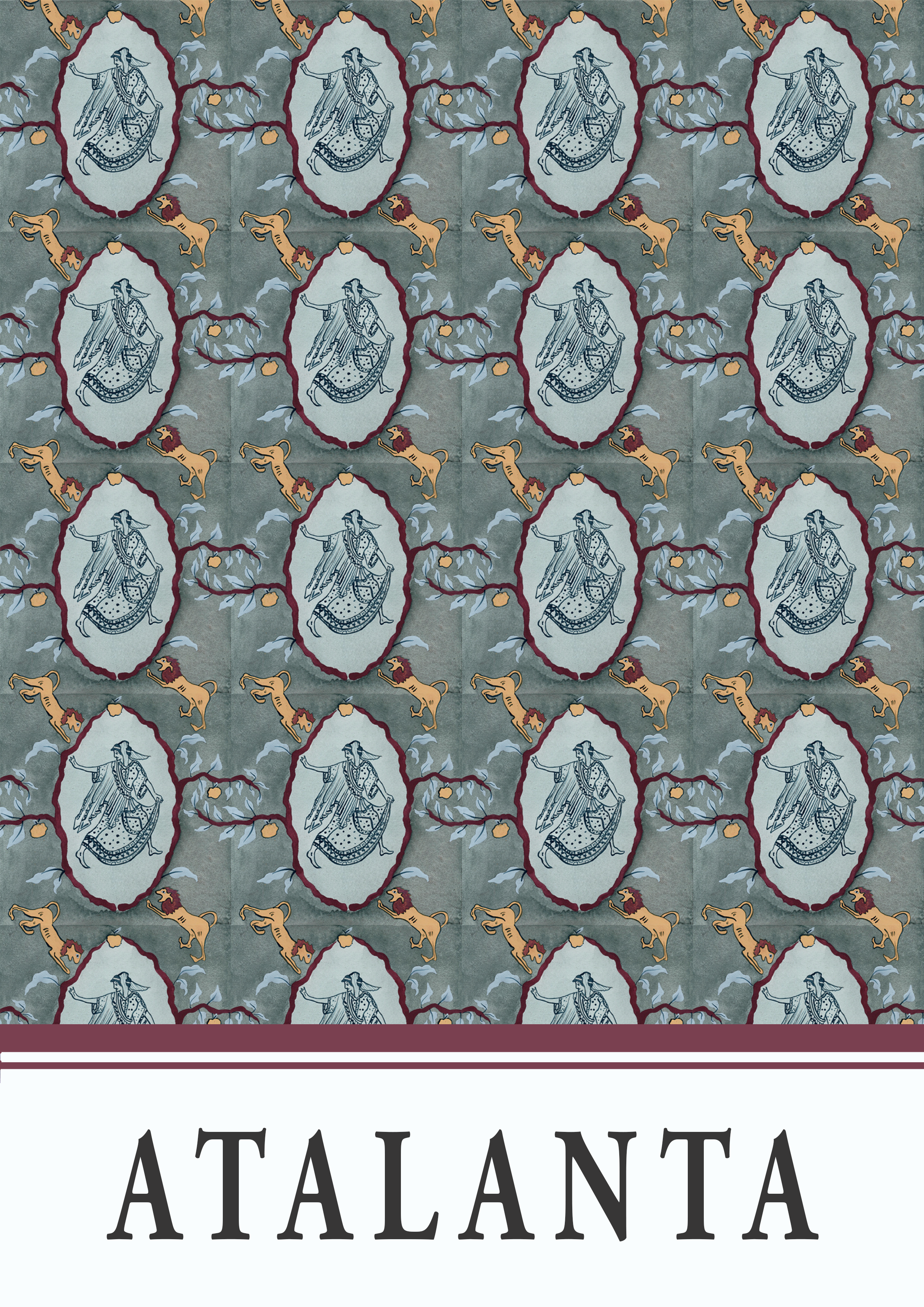

Atalanta figure
Red-figure white-ground lekythos depicting Atalanta between Erotes with wreaths and sprigs
c. 500-450BC
Greek, Athenian
Museum of Art. Cleveland, United States.
Lion motif
Black-figure neck amphora depicting a sanctuary on side A and a warrior and horseman on side B
c. 550-500BC
Greek, Attic
The British Museum. London, England.
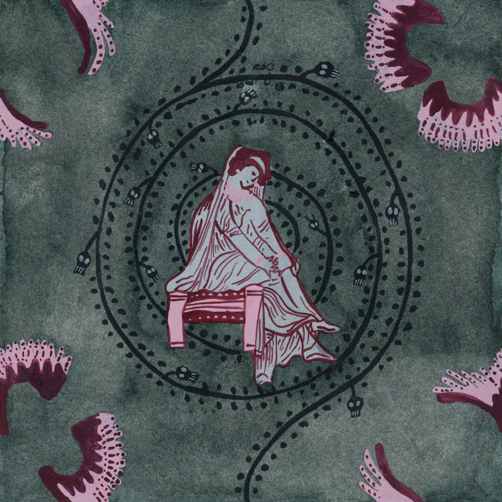
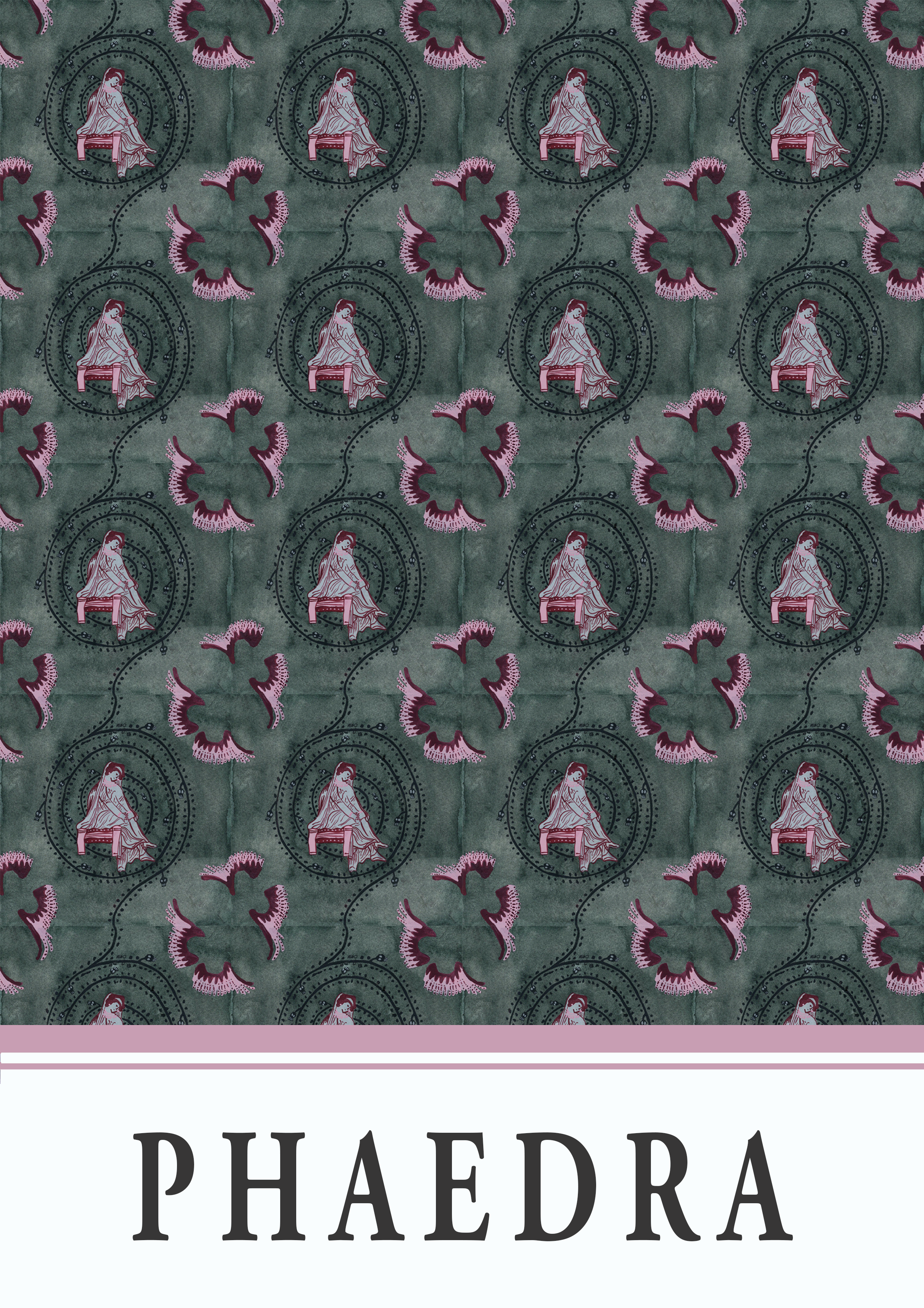
18. PHAEDRA
I really do like the combination of green and pink in this design, particularly on the Phaedra figure herself and I think having both a light pink and a deep magenta creates extra depth in contrast with the mint green.
Unlike most of the designs in this series, one of the main elements that refers to Phaedra’s emotional turmoil, namely the spiral design with tiny skulls springing off it, doesn’t actually come from an ancient source and was just my own addition. While my preference for these Classicstober challenges is to work form ancient sources, I do think I will endeavour to use more of my own create input in the future.
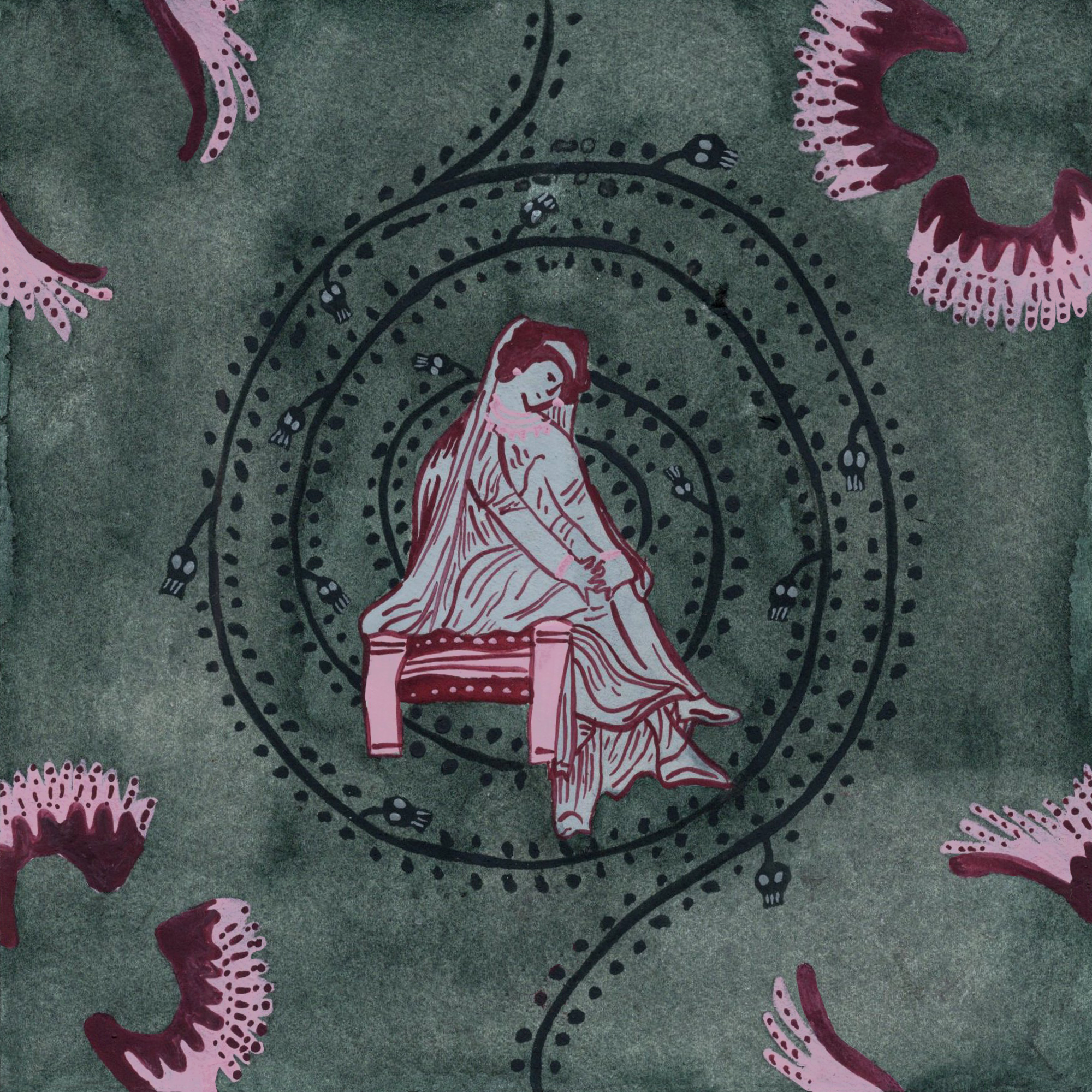


Phaedra figure
c. 350-340BC
Greek, Apulian
The British Museum. London, England.
Ero’s wings motif
c. 350-325BC
Greek, Apulian
National Museum of Scotland. Edinburgh, Scotland.
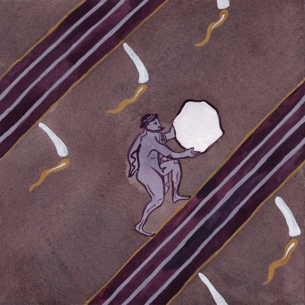
19. SISYPHUS
While a very simple design as a single tile, this one was actually such a nightmare to line up as a repeating pattern because the continuous “hill” crosses over both the left and right borders and the top and bottom borders and also because I, arguably stupidly, added more decorative lines within the main stripe, which meant I had to line all those individual lines up too. I am, however, proud of the overall effect and the way it helps to emphasis Sisyphus’ never-ending task, and I think it was worth the headache.
Compositionally, I do agree with the comment that the overall poster looks a bit too empty, again, you know who you are… I did consider retrospectively adding in more Sisyphus figures in digitally, but I do think now that the somewhat empty composition is actually also quite helpful for conveying Sisyphus’ perpetual task and his unreachable goal.


Sisyphus figure
c. 525-500BC
Greek, Attic
Staatliche Antikensammlungen. Munich, Germany.
Torch motif
Red-figure bell krater depicting a woman holding two torches and a swan
c. 5th-4th century BC
Greek, Attic (?)
National Archaeological Museum. Athens, Greece.
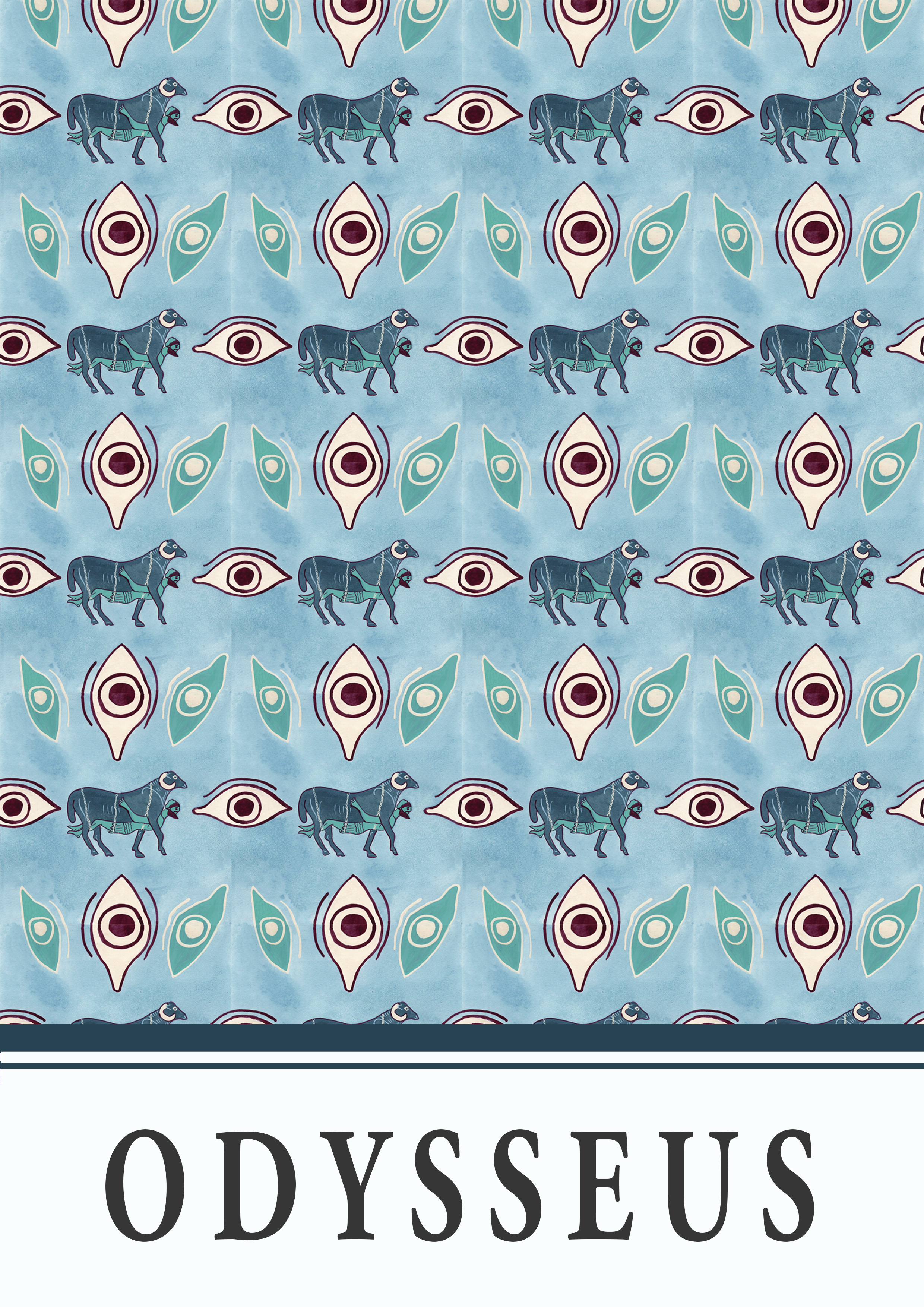
20. ODYSSEUS
I do like the overall design of this prompt, and I find the figure of Odysseus strapped under one of Polyphemus’ rams amusing but I am somewhat unconvinced on the colour palette. Theoretically, I think the colours do work but there’s just something about the overall combination that I don’t personally like. It also reminds me a bit of one of the wallpapers I used to give to decorate the kids’ rooms on Sims 3. At least, I think it does anyway.,,


Odysseus and ram figures and eye motifs
Black-figure column krater depicting Odysseus escaping Polyphemus under a ram
c. 6th century BC
Greek, Athenian
J. Paul Getty Museum. Los Angeles, United States.
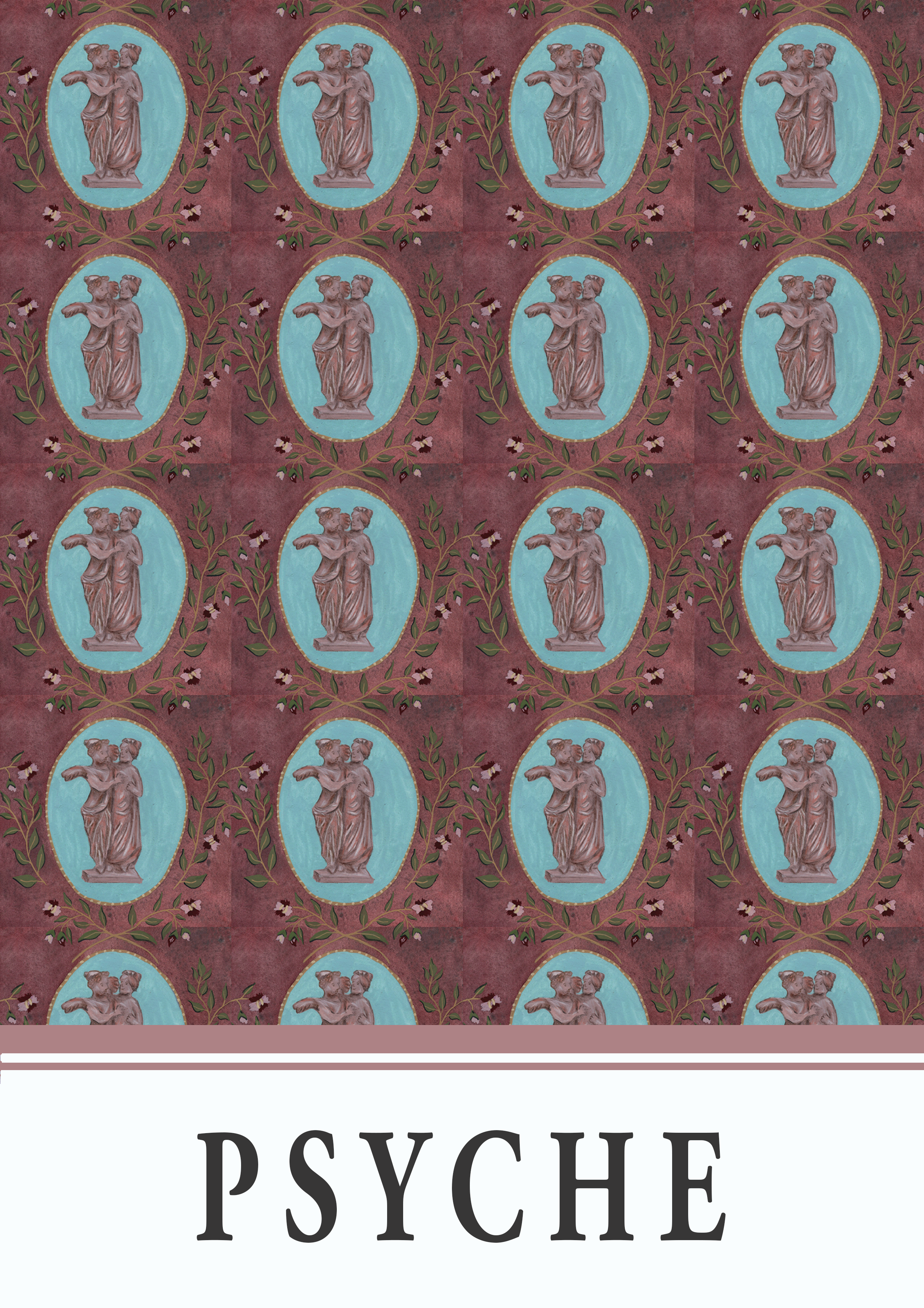
21. PSYCHE
Another favourite of mine, which also contains my favourite happy accident from this whole series: the background! It seems while mixing my dark red background colour, I didn’t mix in the dark brown pigment well enough, which resulted in this almost rust-like/mold-like (in a good way???) pattern of small dark patches amidst the main red wash. I think this also plays into the Florence and the Machine vibe, which I can’t quite articulate, that I get from this design too.


Cupid and Psyche figures
Terracotta statuette of Eros and Psyche
c. 4th-3rd century BC
Greek, Boeotian
The Metropolitan Museum of Art. New York, United States.
Flower motifs
Details of roses on a garden fresco from the “triclinium” of the Villa of Livia Drusilla
c. 30-20BC
Roman, Roman
Museo Nazionale Romano, Palazzo Massimo. Rome, Italy.
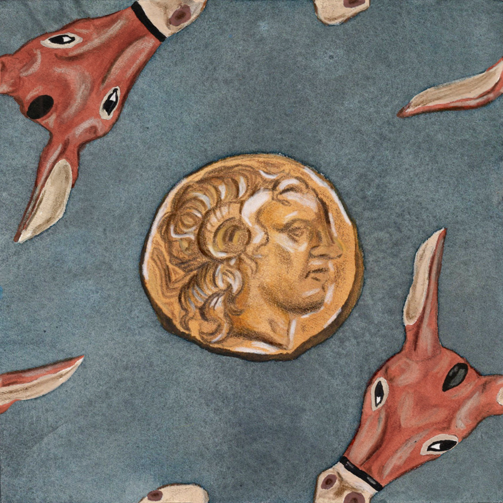
22. MIDAS
I remember being absolutely stumped for this one as there wasn’t much to go on in terms of explicitly Midas-related material culture and I really dreaded doing it, so it did sit on it for a couple of days. In the end, I decided to depict donkeys (not horses, again, you know who you are) to represent the ass ears he grows and a gold coin to represent his golden touch (although I will admit that yes, having a gold coin with Alexander the Great’s face on it was semi-misleading).
Despite all the dread for this one, as I was finishing up the tile, I was getting the feeling that I did actually really like this design and I was very happy when I saw the repeat pattern come together. This is my favourite accidental favourite!


Gold coin motif
Gold coin depicting the deified Alexander the Great on the obverse and Atehna on the reverse
297BC
Greek, ???
Private collection.
Donkey figures
Black-figure kantharos with donkey head attachment
c. 520-500BC
Greek, Attic
The British Museum. London, England.
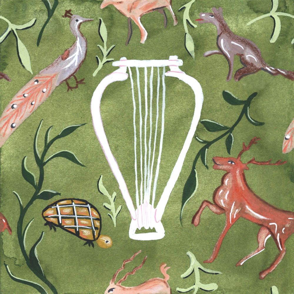
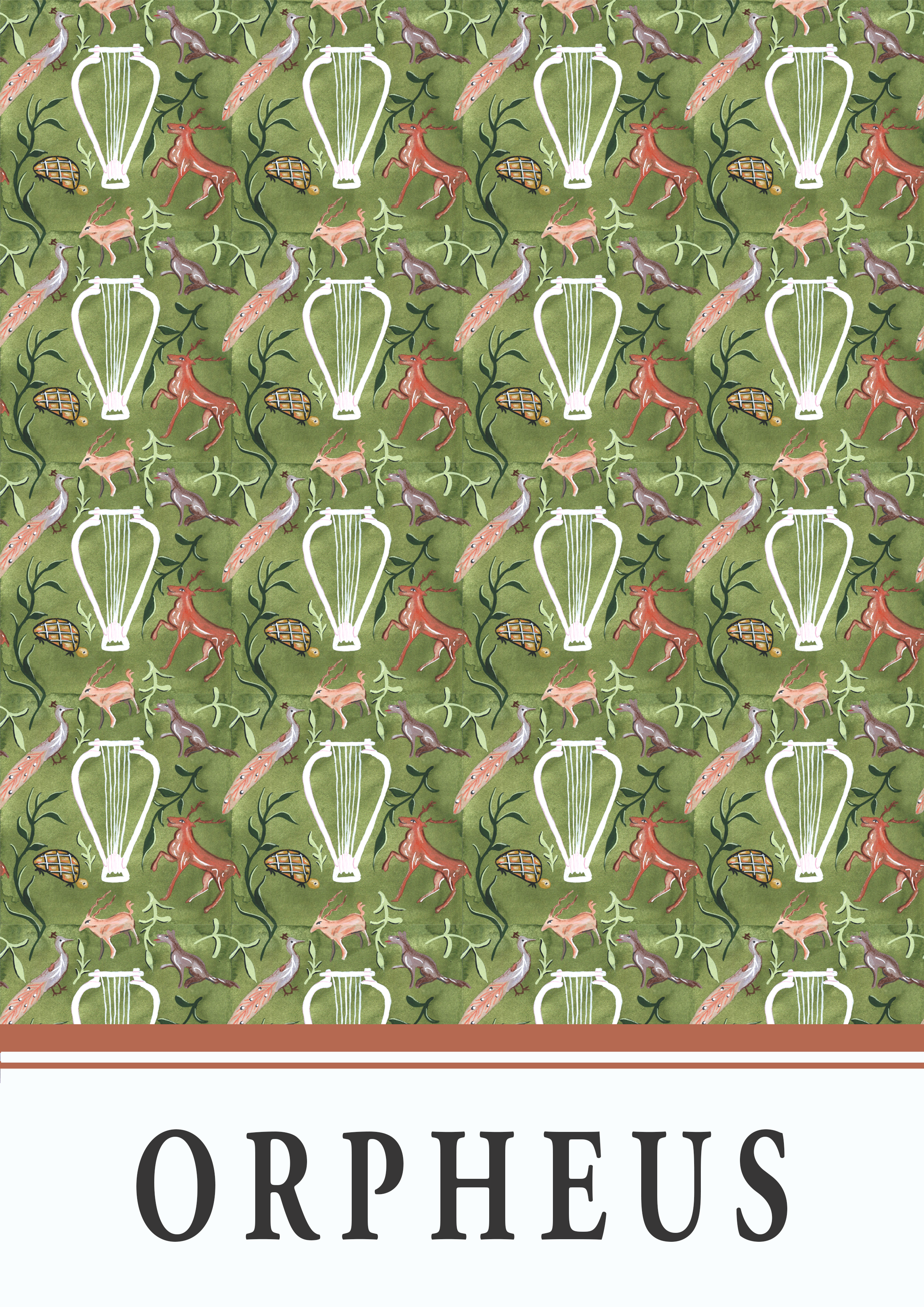
23. ORPHEUS
I have mixed feelings about this one. On paper, this really should have been one of my favourites as I love painting all things nature. However, I didn’t really love the style I ended up employing. I think I would have preferred this piece if I had spent much more time on it and had painted each of the animal fully in gouache and in much more detail than can be seen on the original mosaic. But what can you do, I’m a busy woman (in theory) and I do quite like the overall pattern, even if I am less keen on the close up tile.


Animal and vegetal motifs
Mosaic of Orpheus and animals from building A of of the Piazza della vittoria in Palermo
c. AD 200-250
Roman
Regional Archaeological Museum Antonino Salinas. Sicily, Italy.
lyre motif
Terracotta red-figure kylix depicting a man playing a lyre, attributed to the Dokimasia Painter
c. 480BC
Greek, Attic
The Metropolitan Museum. New York, United States.
24. HEPHAESTUS
It is close, but I think this one has to be my all-time favourite! It is also another one that I was dreading because I wasn’t feeling massively inspired by the fairly limited amount of Hephaestos imagery that I found. Once I thought about doing a volcano though, I knew exactly which image I would be working from as I was lucky enough to see the fresco (originally from Pompeii) of Dionysus in a grape costume next to Mount Vesuvius at the Ashmolean as part of their Last Supper in Pompeii exhibition while I was an undergraduate. I was happy to also find some images of stilts (passably herons in my not-so-reliable opinion) in the same Roman fresco style to add into the mix as Hephaestos’ sacred animal. I’m very happy with how I recreated the fresco style with gouache and coloured pencil (I’m particularly happy with the dry brush technique I used on the grassy part of Mount Vesuvius).
I’m very happy with the pattern density and the colour combination of this one too and in the highly unlikely event I could ever own my own home, I would love to slap this up as a wallpaper alongside my dark moss green curtains.


Volcano and vegetal motifs
c. AD 60-79
Roman, Pompeian
Museo Archeologico Nazionale di Napoli. Pompeii, Italy.
Crane motifs
Fresco depicting stilts from the peristyle of a house in Vienna
c. 1st century AD
Roman
Musée gallo-romain de Saint Romain en Gal. Vienna, Austria.
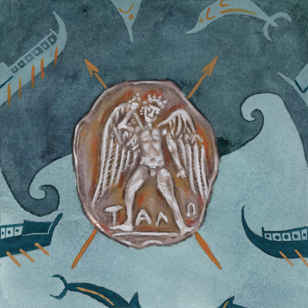
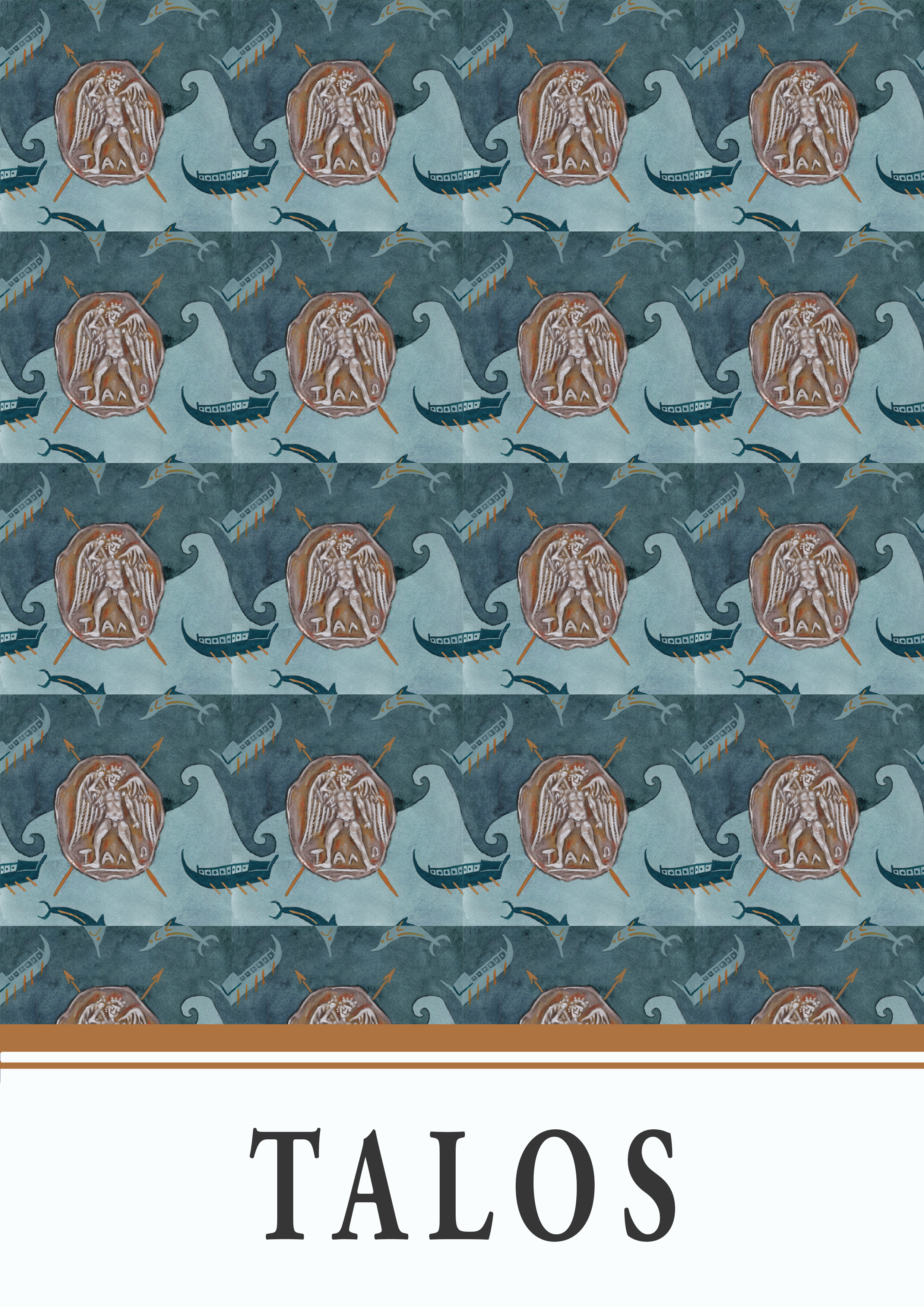
25. TALOS
As I mentioned earlier, I had never even heard of Talos, so I was a little apprehensive approaching this one. As it turns out, there are also fairly limited sources for Talos and not that many special attributes so I ended up just painting the coin with his depiction on it which seems to come up the most with a quick Google search.
To jazz things up a bit though, I decided to split the background colour, which is the first and last time I did this in this series. I do remember considering doing this for another earlier tile (I can’t remember which one it was now) but decided against it for consistency. But since I wasn’t massively excited about this one and this was the second time I had thought about doing it, I decided to just do it anyway (hey, these are my art piece, I can do whatever I want, right?). I’m glad I did because the background is much more interesting, and it was really the only way to incorporate the wave pattern without just drawing it in with a line (which I don’t think would have provided a very strong contrast and would have got lost amongst the other much larger design elements).
I do wonder if the orange on the darker part of the background should have been lighter for contrast reasons but aside from that, I think I was pleasantly surprised on this one, even if it isn’t a stand-out favourite.


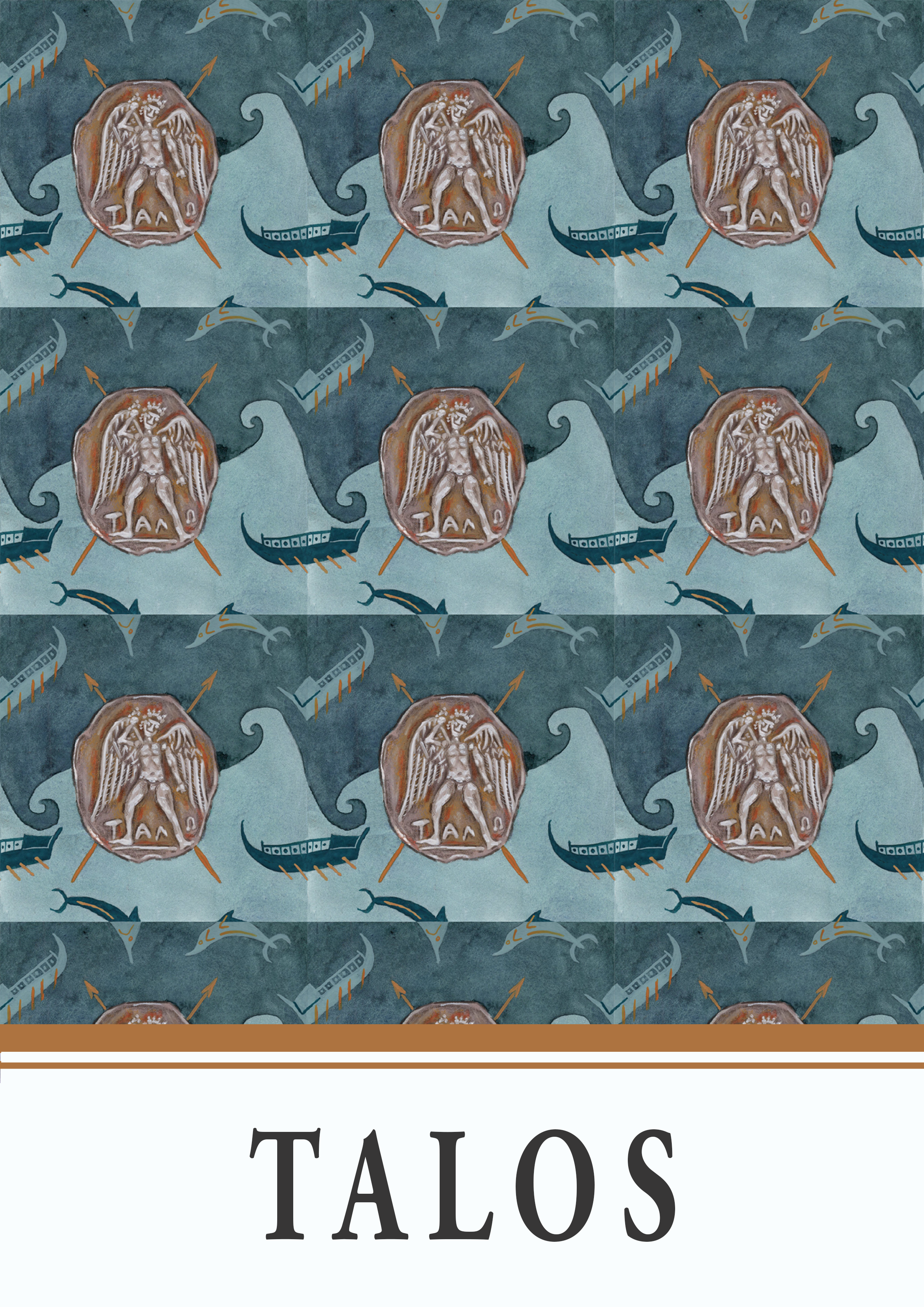
Talos figure
Silver coin depicting Talos on the obverse and a bull on the reverse
c. 300-270BC
Greek, Cretian
Private collection
Trireme motifs
Black-figure vase depicting a trireme on the inner rim
c. 6th century (?)
Greek, ???
???
Unfortunately, I could not locate this artifact within a catalogue so these details are quite vague… Please let me know if you have any further details!
Dolphin motifs
Black-figure type-A Kylix cup depicting Dionysus in a ship surrounded by dolphins (The Dionysus Cup)
c. 530BC
Greek, Athenian
Staatliche Antikensammlungen. Munich, Germany.
26. THETIS
I was very unsure while creating and painting this design. In particular, I was unsure about the colours. I knew I wanted the palette to be very blue to fit the fact Thetis is a nereid, but while I was painting, it all felt very dull and muddy to me. I also thought that the “seaweed” element (which is actually part of a land plant in its original fresco context) should be larger and play a bigger part in the design. I was so close to stopping half-way through the tile and redoing the whole thing and then when I didn’t and I saw the final repeat pattern, I decided I was going to post it to my Instagram, but with the caveat that I was going to redo it the next day.
To my surprise, people actually liked this pattern (thanks particularly to Jane for encouraging me to keep it and for taking the time to break-down why she liked it!). Looking at it now, I do genuinely believe the colours do work together, that they’re not actually muddy, and that the pattern balance is okay (I do somewhat wish the “seaweed” motif was a bit more integral though). Even though I know this to be true, this one is another reminder that sometimes you just have to look back at your art after a while and not to immediately stick with the inner-assertion that it’s bad (I’m so very guilty of the “I hate this” mentality as soon as I finish a piece that I’ve spend multiple hours on though).


Thetis figure and dolphin figures
c. 510-500BC
Greek, Athenian
Museum of Fine Arts. Boston, United States.
“Seaweed” motifs
Fresco depicting swallows and lillies from Akrotiri
c. 1600BC
Greek, Minoan
Athens National Archaeological Museum. Athens, Greece.
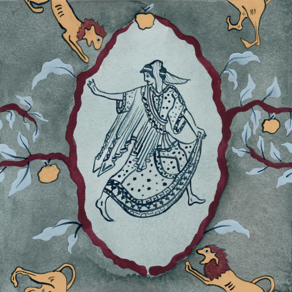
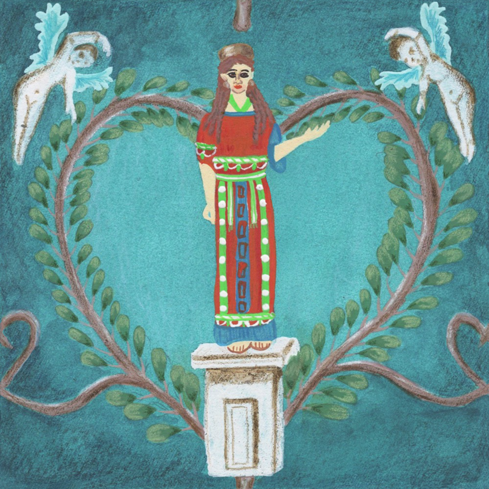
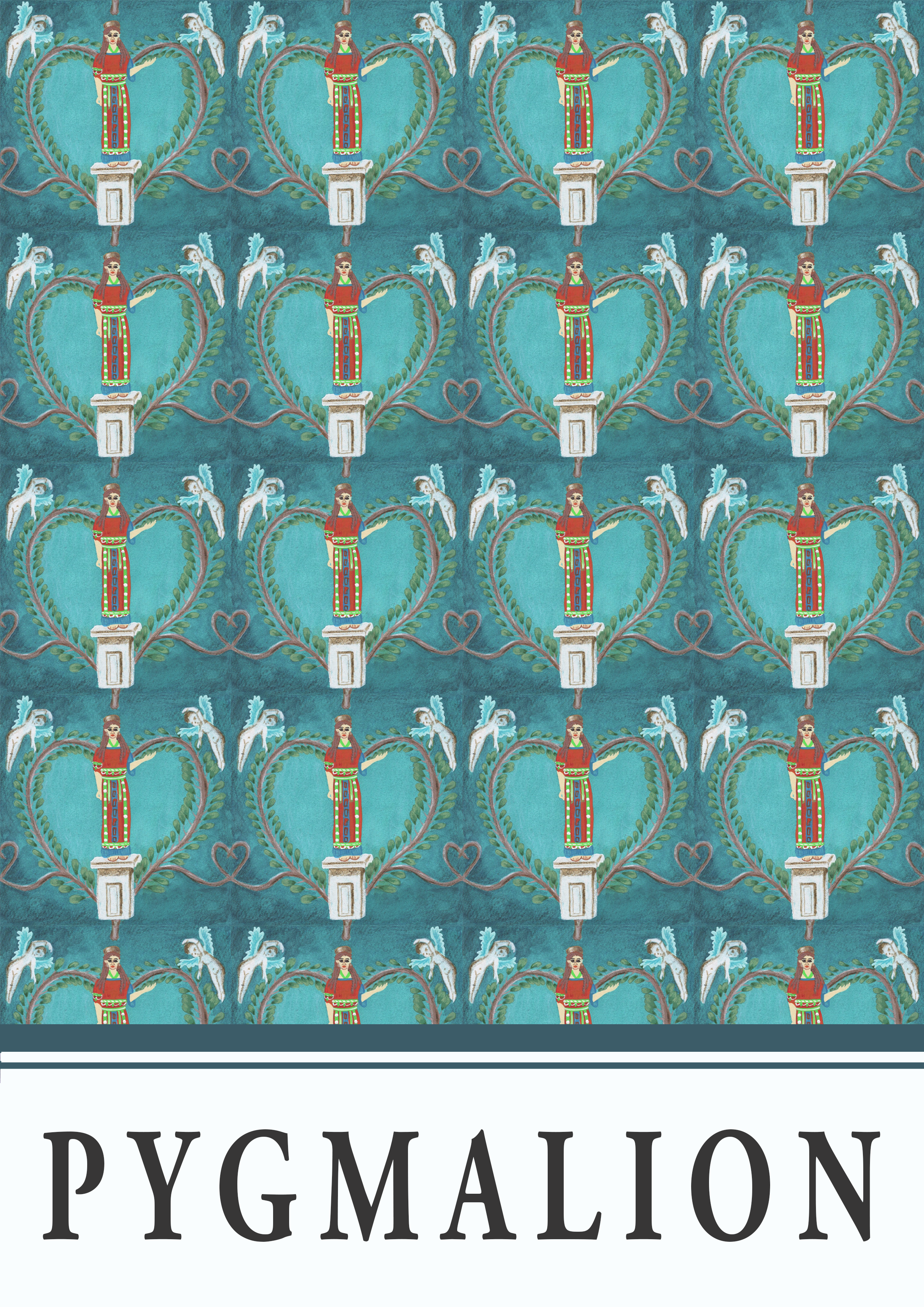
27. PYGMALION
Admittedly quite a romantic take on the OG build-your-own-girlfriend story but, shamelessly, I think it looks good and l’art pour l’art, you know.
In contrast to my IRL wardrobe choices (which I’m lovingly and frequently told are quite monochromatic and dark), I opted for the fun, colourful version of Greek statues, rather than the plain (and inaccurately) white ones we’re more used to seeing. This was partially for visual interest reasons, but also because I do think it is important that we recognise that ancient art was much more colourful that the (particularly Western) canon has suggested (so maybe not always just l’art pour l’art: everything in moderation, I guess).
Overall, this one is giving me kitsch Versace vibes and you know what, mi piace.


Kore figure
Polychromy reproduction of the Peplos Kore
c. 530BC (reproduced cast 1975)
Greek, Athenian
Cambridge Museum of Classical Archaeology. Cambridge, England.
Cupid motifs
Fresco of Eros riding a crab from a Roman house in Pompeii
c. 1st century BC
Roman, Pompeian
National Archaeological Museum of Naples. Naples, Italy.
Unfortunately, I could not locate this artifact within a catalogue so these details are quite vague… Please let me know if you have any further details!
Bough motif
Fresco depicting a statue of Mars as part of a garden scene from the House of Venus in the Shell
c. 1st century BC
Roman, Pompeian
In situ. House of the Venus in the Shell, Room 11. Pompeii, Italy.
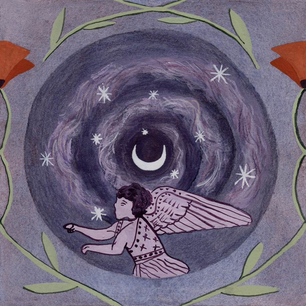
28. NYX
While I do like the overall design and colours for this one, there are a couple of things I would like to tweak execution-wise.
While researching sources for Nyx, I got really inspired by the diaphanous cloaks she was often depicted wearing. For my design, I wanted her to have almost smoke-like diaphanous cloak spiralling into the gradually darkening night sky (represented by gradually darkening concentric circles). Using an opaque medium like gouache, however, doesn’t exactly lend to a diaphanous quality… I did try to use a more watered-down mixture and put less paint on my brush, but this also made it quite hard to get the brush texture and the movement I also wanted. I also wanted a strong-ish contrast between the swirl and the sky, so it was quite difficult to balance the viscosity of the paint mixture to achieve both things. In the end, I went with an opaquer mixture with even more opaque line details and some coloured pencil details to put more focus on the movement and shape of the swirl. In this way, I obviously lost the diaphanous quality and this, in combination with the placement of the swirl, meant that I lost the concentric circle effect in the sky (although you can still tell it gets darker towards the middle of the circle).
One other thing I think needs tweaking is the contrast levels between the sage green poppy stems and the pale purple background. I think the background needs to be a tad darker for contrast, but it can’t be too dark in order to maintain a contrast between the background colour and the night sky circle.
One of the things I did really like in this piece is the dreaminess of the background wash which has more purple-hued patches in some places and some bluer-hued patches in other, again another accident from the pigments separating slightly in the mix. I am also pleasantly surprised by how the red of the poppy head works with the overall purple colour scheme as red and purple are not normally colours I place together.

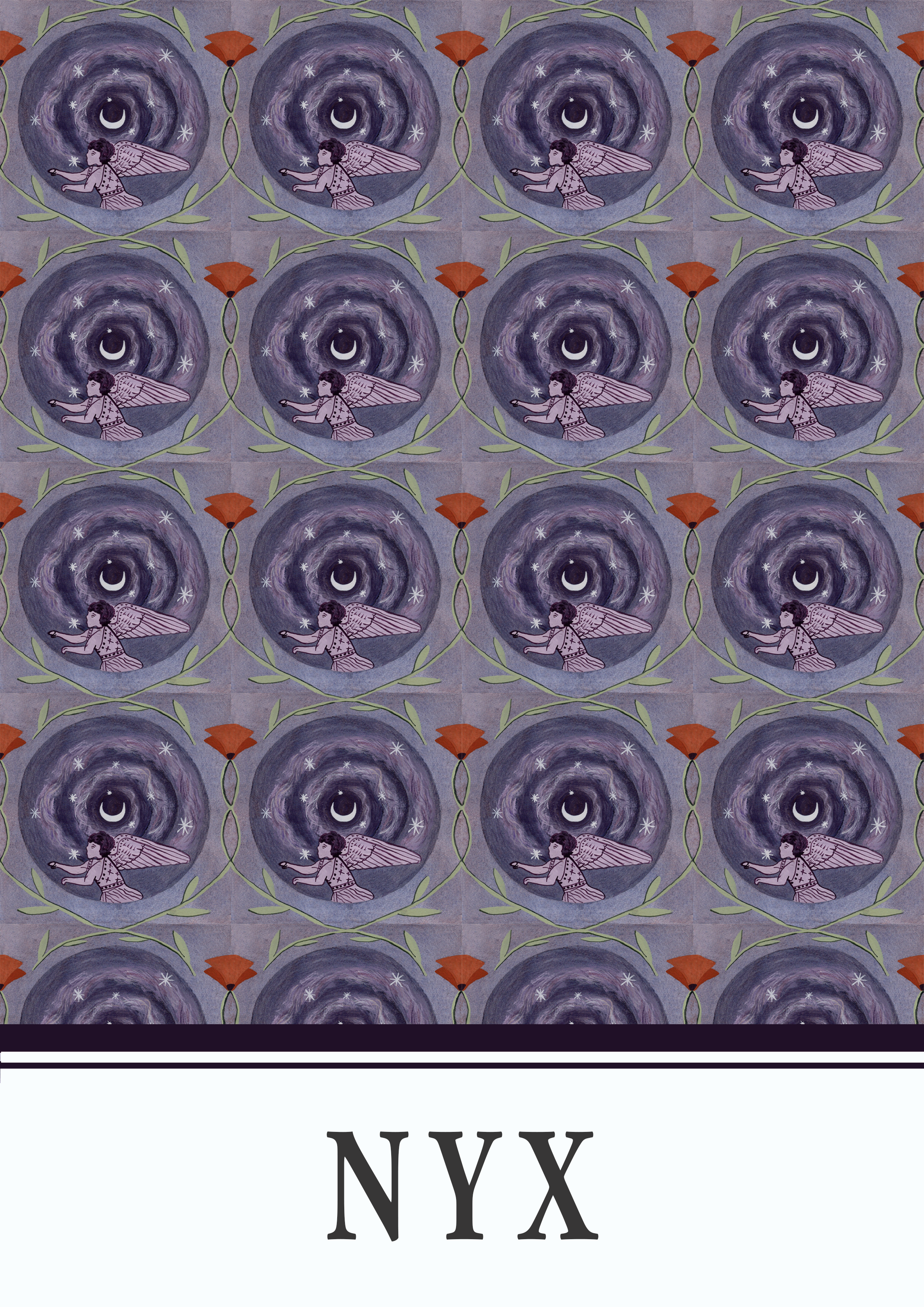
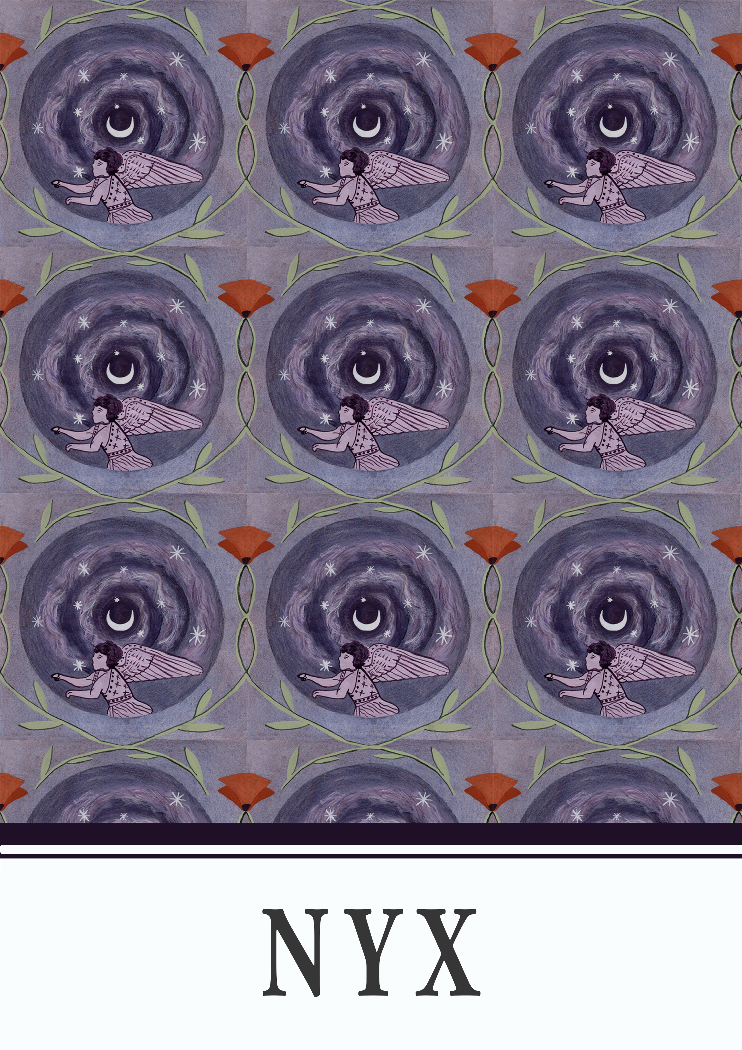
Nyx figure
Red-figure pyxis lid depicting Nyx on a chariot, attributed to Attic Query
c. 425-375BC
Greek, Boeotian
Ashmolean Museum. Oxford, England.
Moon and star motifs
Carnelian intaglio depicting the moon and starts
c. 2nd century AD
Roman, ???
Private collection
Poppy motif
Ceramic fragment depicting a cow in a swamp with flowers
c. 14th century BC
Egyptian
Musée du Louvre. Paris, France.
29. NEMESIS
This one was also a personal nemesis of mine. I did 3 sketches for this one and made 2 tiles (the first one will never see the light of day). I think this is just one of those ones that I simply did not want to do, and I think that comes through…
I will say that I do like the overall repeat pattern composition of this one and I very much enjoyed having a design that did work a part of a larger repeat pattern but that did not actually have any elements that were split over the left and right sides or the top and bottom sides because it saved me a lot of editing time!
What I dislike the style of the Nemesis figure itself (although I do quite like her dress!). So, I think this one works less well as a close up single tile and better as a larger repeat pattern.


Nemesis figure
Red-figure neck amphora depicting Nemesis and Tyche by the Heimarmene Painter
c. 430BC
Greek, Attic
Antikensammlung Berlin. Berlin, Germany.
Wing motifs
Fresco of a winged female (Nike)
c. AD 50-79
Roman, Boscorealen
J. Paul Getty Museum. Los Angeles, United States.
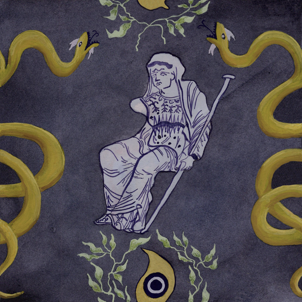
30. TIRESIAS
This one has to be another favourite, I love how rich the colours are and how this helps make Tiresias look quasi-divine, which I think is also helped by the fact he is depicted much larger than many other of the figures I’ve done on other tiles. I also like the larger scale of Tiresias because we can get a more detailed view of the drapery details, which have really nice movement and depth on the original vase.
The one tiny change I would make if I could is to slightly minimise the size of the eye and wreath and move them down a little so they’re less close to Tiresias’ feet.


Tiresias figure
c. 340-330BC
Greek, Apulian
Museum of Fine Arts. Boston, United States.
Wreath motif
Fresco depicting a wreathed woman’s face
c. 1st century BC (?)
Roman, Herculanean
Naples National Archaeological Museum. Naples, Italy.
Unfortunately, I could not locate this artifact within a catalogue so these details are quite vague… Please let me know if you have any further details!
Snake motif
c. 1st cenutury BC (?)
Roman, Pompeian
In situ. House of the Cryptoporticus. Pompeii, Italy.
Unfortunately, I could not locate this artifact within a catalogue so these details are quite vague… Please let me know if you have any further details!
Eye motif
Terracotta black-figure kylix cup depicting a warrior and triremes in between eyes
c. 520BC
Greek, Attic.
The Metropolitan Museum of Art. New York, United States.
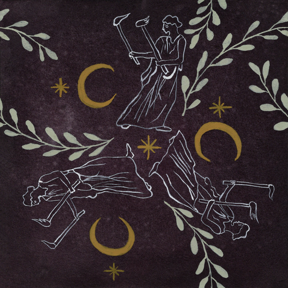
31. HECATE
The final design! This was another one that I was less sure about when creating the tile itself and I umm-ed and ah-ed about whether or not to give the Hecate figures a solid fill colour or not because I worried that they looked a little weak in comparison to the other solid-filled decorative elements on the tile. I decided to keep the plain line work though because I didn’t want to cover up the nebula-esque effect I had created with the watercolour background.
But once again, when I put the repeating pattern together, I was pleasantly surprised by the outcome and this one became another one of my surprise favourites, as well as a favourite of those who had been following along with my posts! I can’t really explain it, but I think seeing the repeated Hecate pattern in only a white outline conveys a sense of magic, mystery, and eeriness (maybe?) that makes sense to me for her character. I also think it helps that the very pale colours of Hecate, the moon and stars, and the leaves seem to glow against the much darker space-like sky in the background. Very pleased to have ended on a good one!


Hecate figures
c. 475-425BC
Greek, Athenian
The Metropolitan Museum. New York, America.
Moon and star motifs
Carnelian intaglio depicting the moon and starts
c. 2nd century AD
Roman, ???
Private collection
All Pieces


Thank you so much for taking the time to look through my Classicstober 2023 works, I hope you enjoyed them!
Illustrations for Sale
Last year, I put up my illustrations on Redbubble but from my experience, the cut they take is a bit too big for me to justify… I have left last year’s illustrations up and can still purchase prints and other merch from that Redbubble store if you so wish however, my plans for this year’s illustrations are slightly different. This year, I will produce a small booklet (probably A5) which will include all my Classicstober2024 illustrations. Additionally, I will print a selection of the posters in either A4 or A3 size (I need to look further into costs). These products will then be available on my shop which is hosted on this website when I reopen it. However, since this will mean an upfront cost for me, I can only print so many designs at first so it would be really helpful for me if you dropped a comment here or reached out to me via email to let me know which designs you would prefer to be available! If things go well, I may look into releasing another round of designs.
Closing Notes
Please do leave a comment below if you enjoyed looking through this series!
Again, if you spot any errors or have any extra information, please don’t hesitate to let me know!